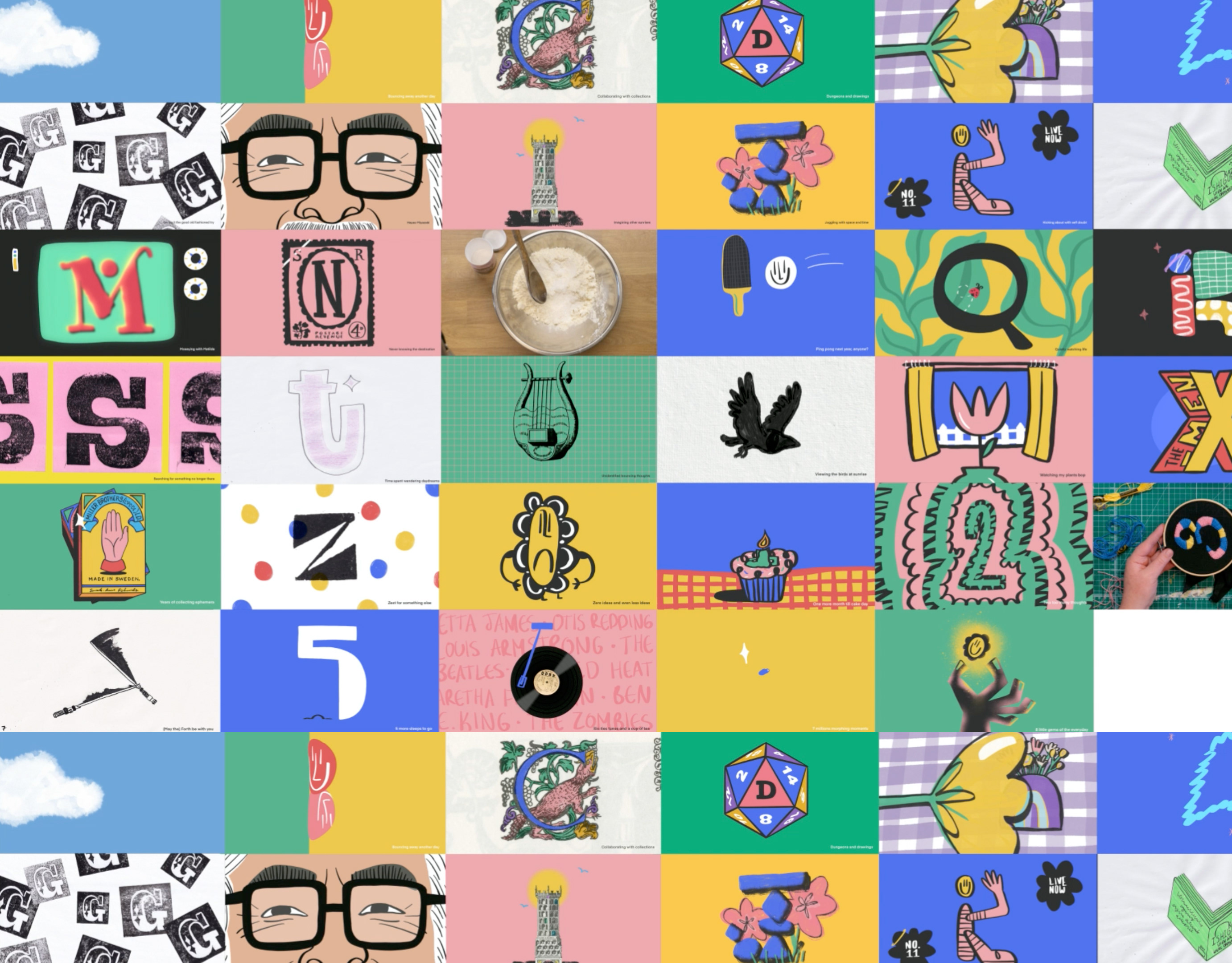
@StillHereStillLife Instagram Prompts
Design, Illustrations and Motion
Following prompts from @stillherestilllife, this is an ongoing project of trials and tests to improve my illustrations and animations (all while having fun playing with different styles!)

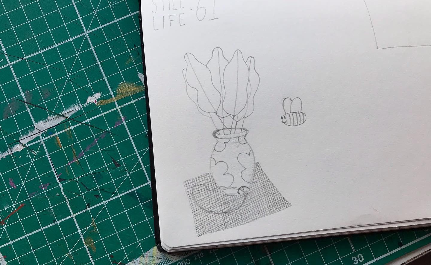

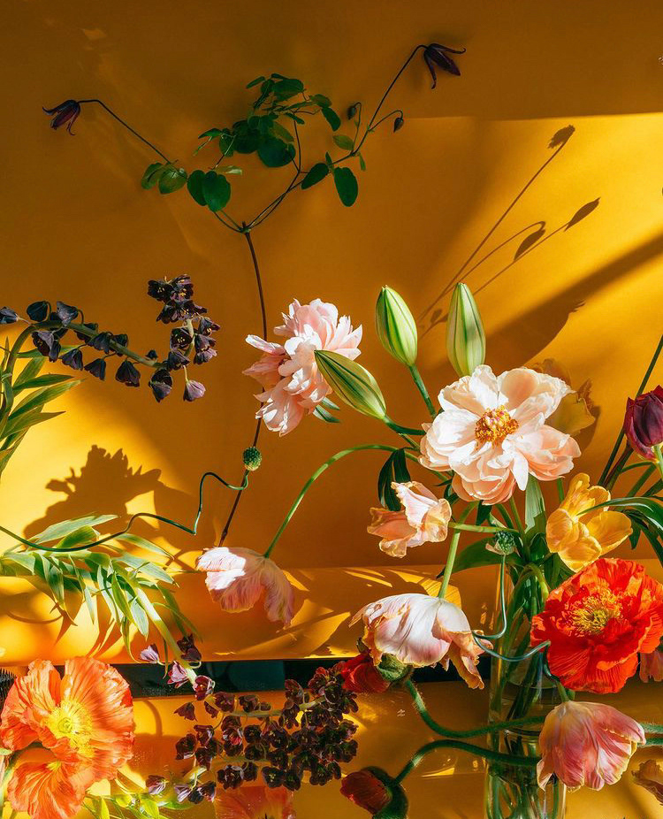
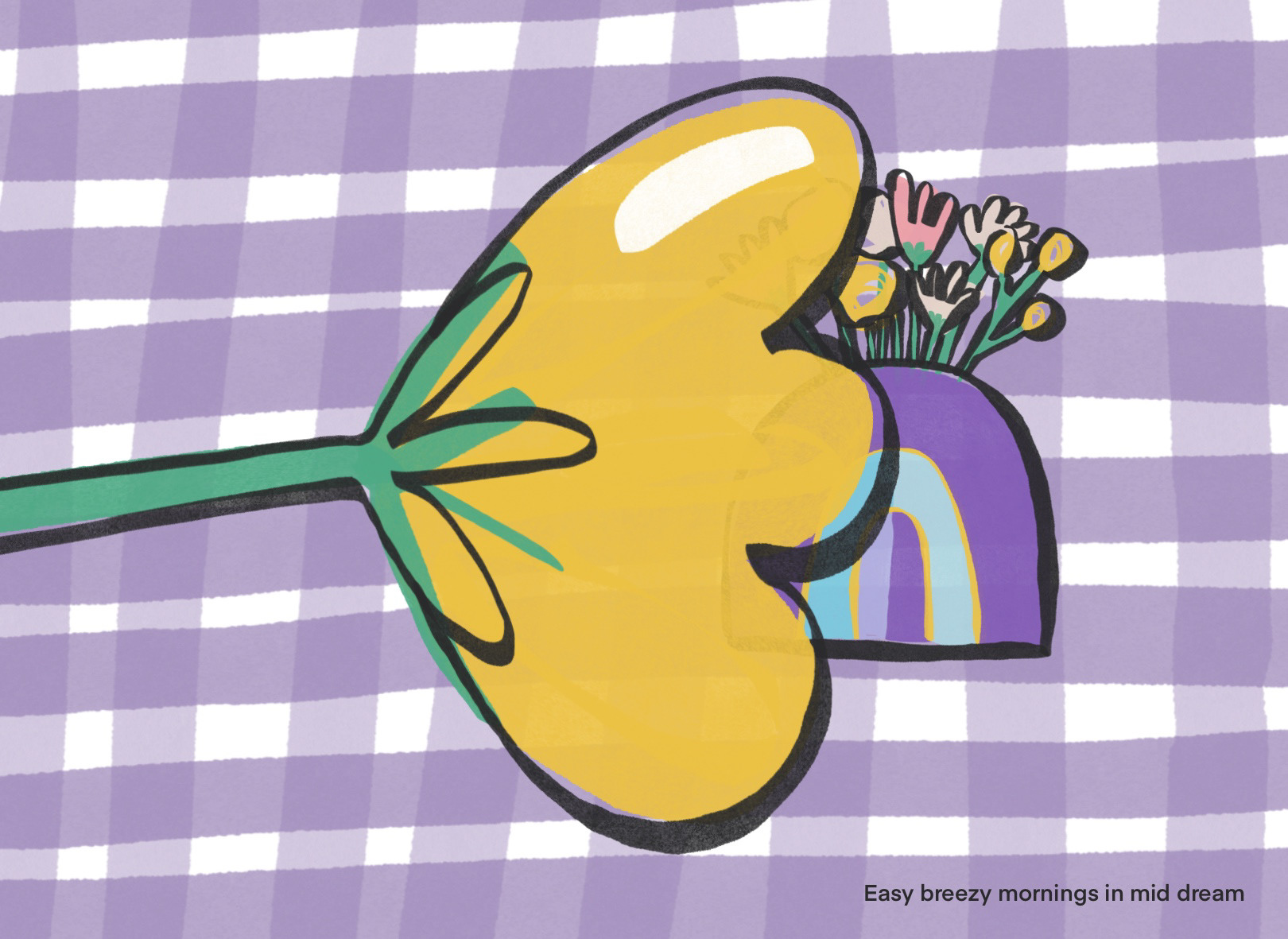
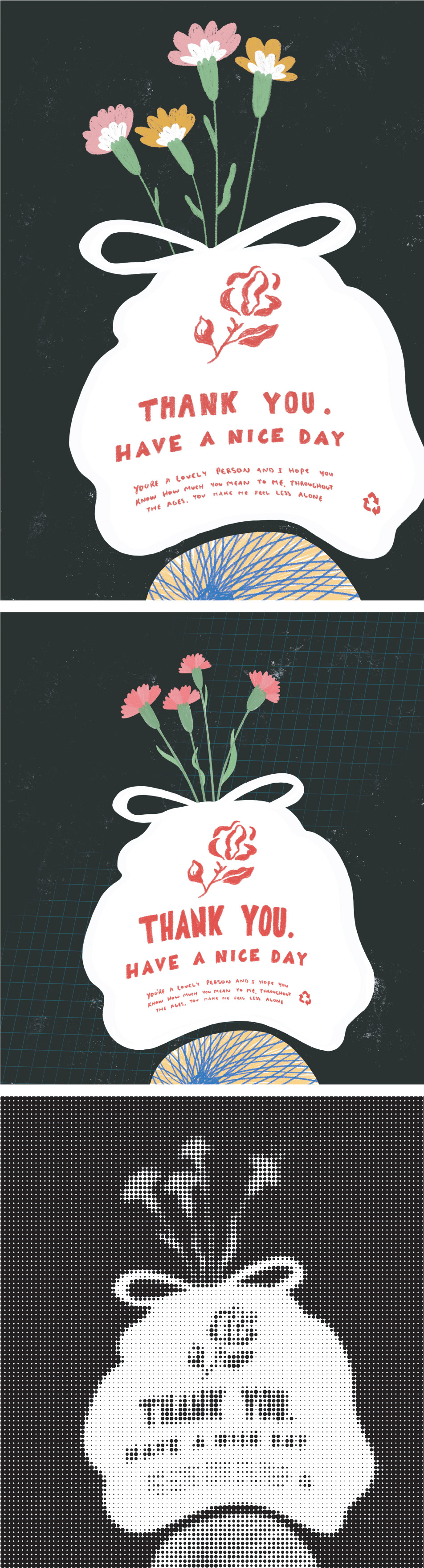
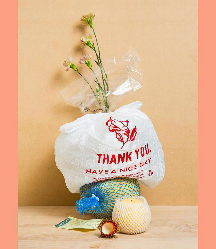
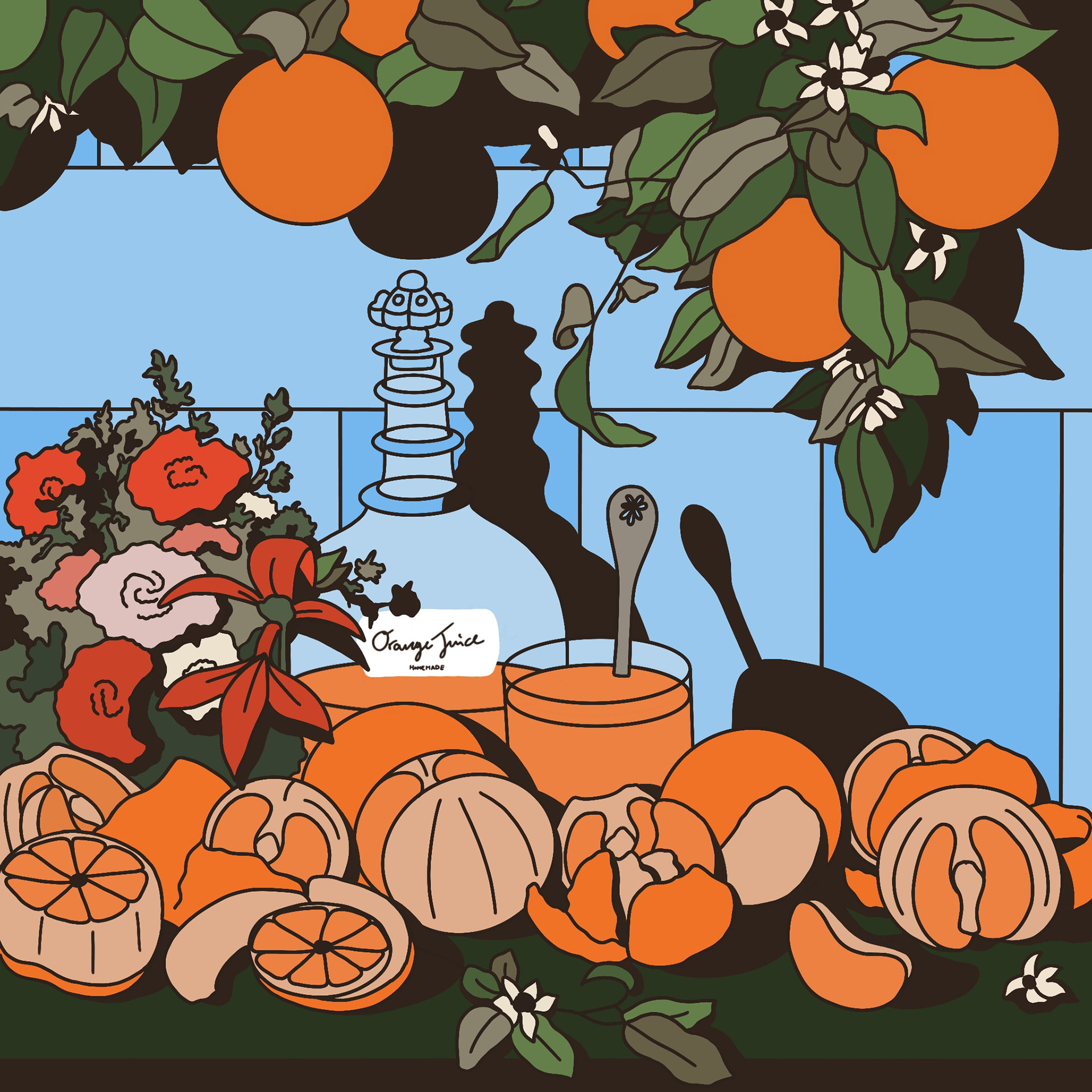
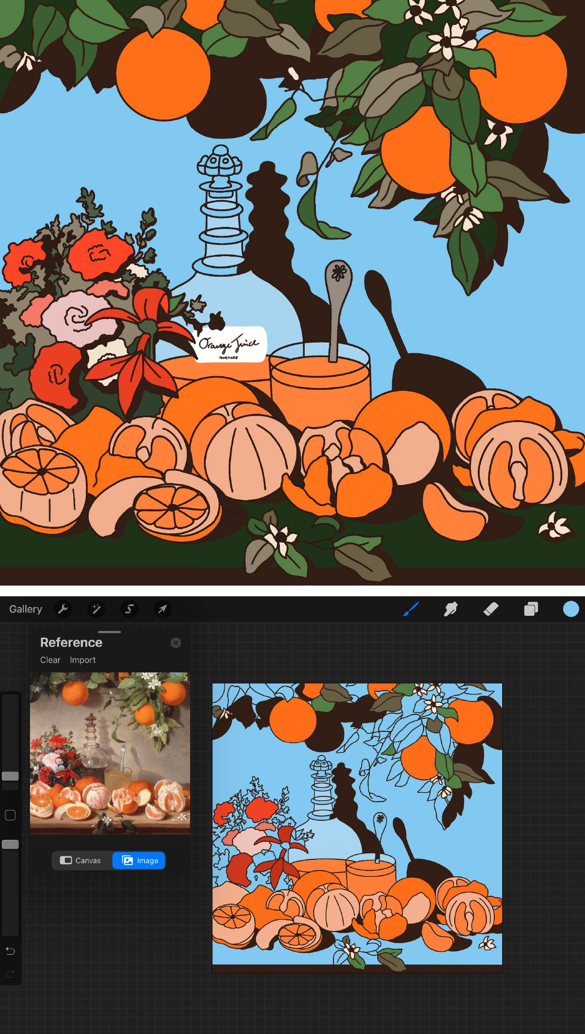
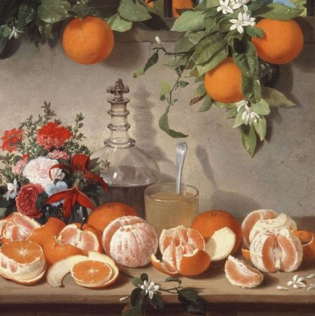
Week 61: Two things that instantly jumped out at me when I saw this image was the beautiful leaves and cheeky bee. I just knew they had to be my focus and after starting the above little sketch I decided to focus on just these two elements, while bringing in some of the colour and patters on the table cloth to the vase.
The final was fully animated in Procreate, taking many layers and a little frustration at the fact that I chose to make the 3 second loop take 42 hand drawn leaf layers, but it was a lot of fun as well :)


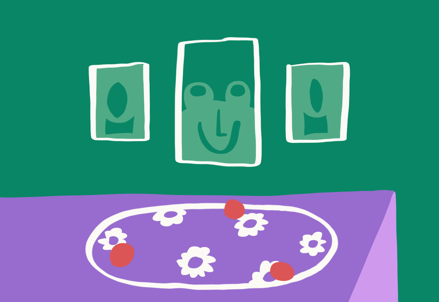
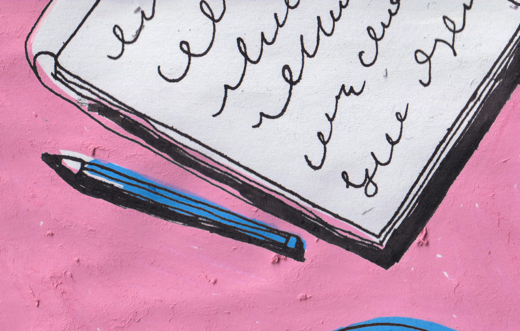
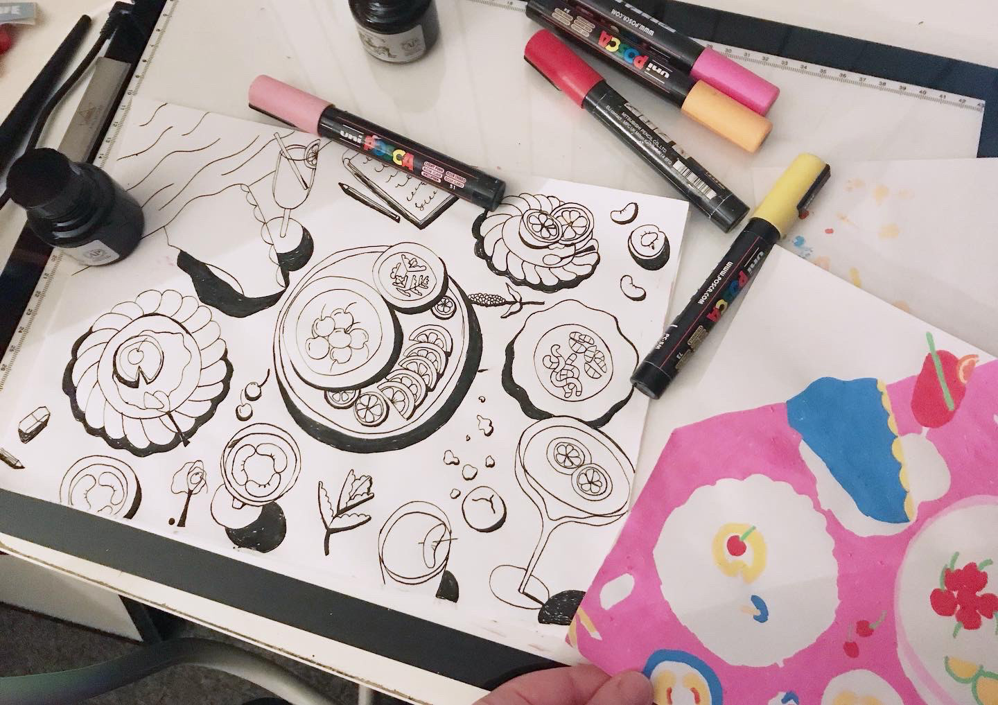
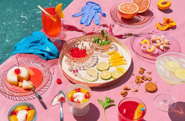
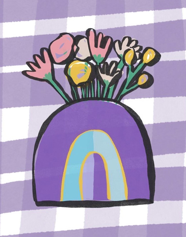
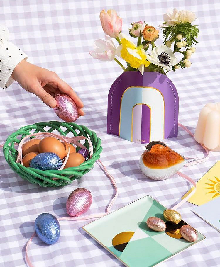
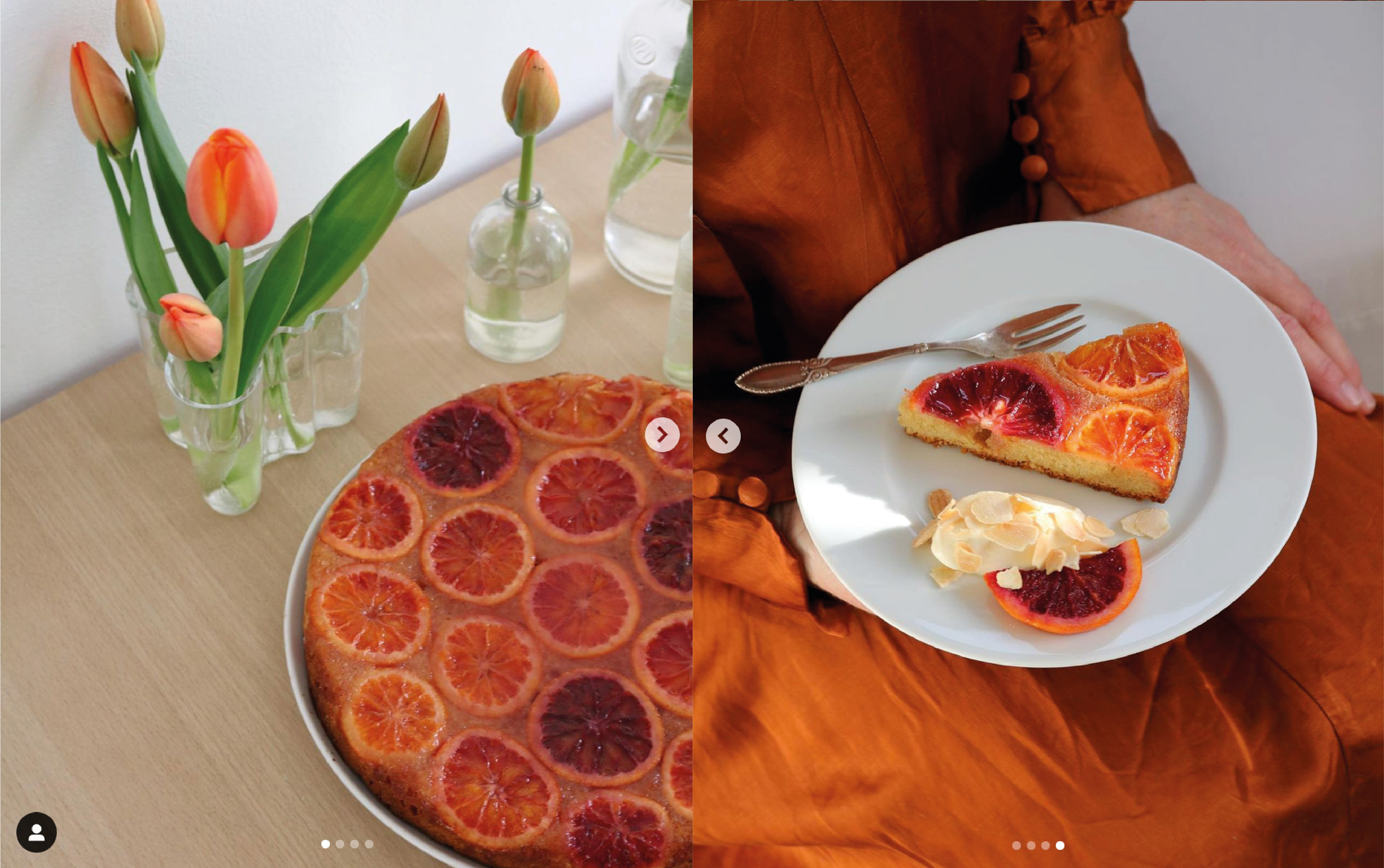
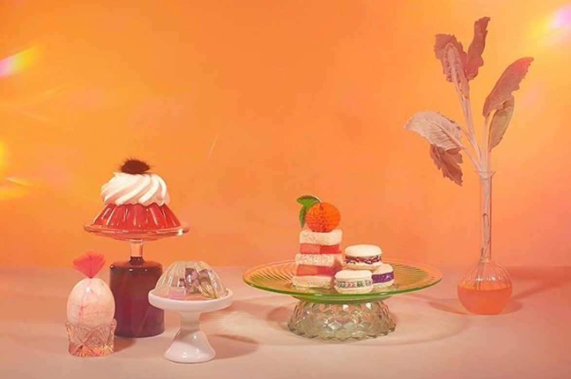
Week 60: After a few weeks heavily focused on food this was a bit of a nice shake up! I decided to focus on keeping it simple and fun, using a recent favourite of ink and Posca.
I briefly thought about colouring it using coloured pencils, but the boldness of using block colours won out. One thing I would've like to do is go back and maybe try adding shadows, but I'll keep that in mind for future works.

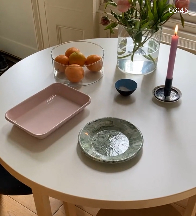
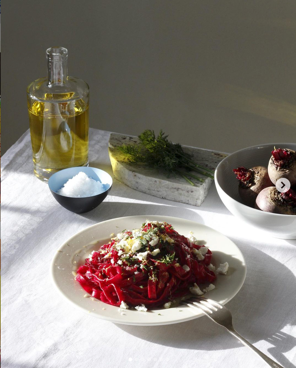
Week 59: Loving the composition, but wanting to deviate from the image to get some motion and other colours involved, I went through a few renditions of the scene until I just started having fun and decided to have the pasta be the main carry over.
They say use as much or as little from the reference, but I'd defitely say this is on the little side! Although I'm kind of happy for it because its helping in finding a style I enjoy (not that I want to boxed in, just that I want to build up something of my own).

Week 58: Using a combination of ink and Posca I made a loose interpretation of the scene that was built up over the video tutorial StillHereStillLife posted on their instagram.
I chose to make this one by hand as I really wanted to trial using my new background colours (the sheet of yellow and more to eventually come) and get some good old funky hand made textures.
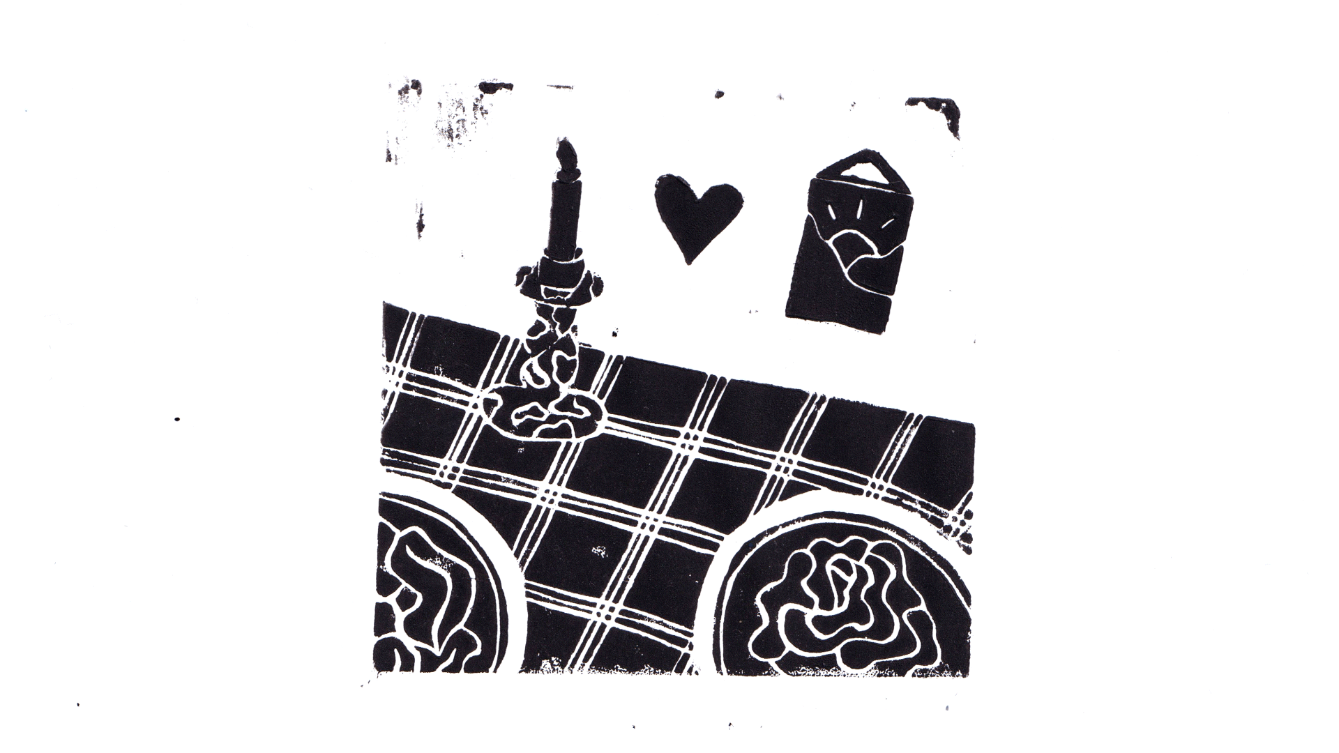
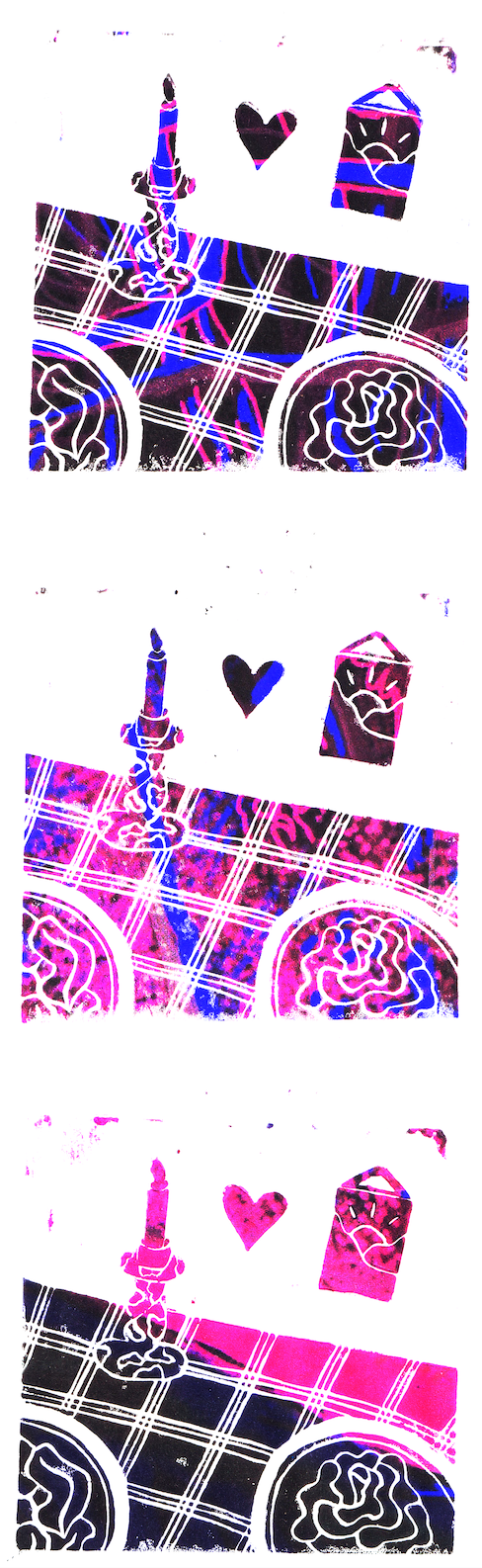
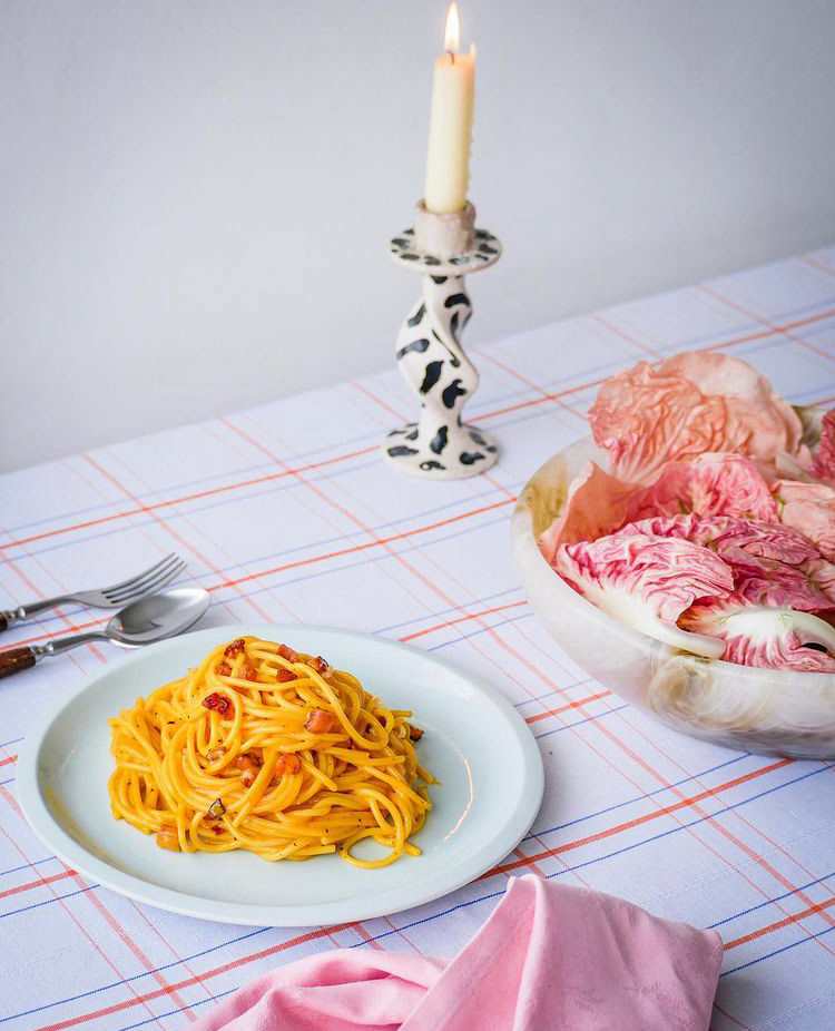
Week 59: While working on Nowdio I was inspired to work on a more detailed piece using Lino and good old black ink.
I printed a few pieces before it looked quite right, but as I liked some of the variations I thought why not make them boil to give a little life to the candle and scene in general.

Week 56 (they took 2 weeks off): After the fast paced, mostly digital and minimal detail, challenge that was 36 Days of Type I decided to take this rendering to the max and fully immerse myself in some of my favourite materials: Ink and Posca.
Deciding to take a very literal interpretation of the image I spent some time recreating as much detail in pencil at first, tracing this with ink using my light pad and then doing the colour layer traced over the ink (as it can be really hard to go over Posca with ink due to the uneven texture. These layers were then scanned and multiplied in Photoshop to create a cool blend of misaligned lines :)
Week 53: Doing 36 Days of Type for the month (and a bit) of April and May I didn't want to get too far behind on this prompt series, but also know there 1) wouldn't be enough time to do both 2) I didn't want to be posting anything but the letters during that challenge. So all of this in account I decided to do a bit of a colab of the prompts/challenges and made this hybrid :)
Made using procreate, I chose to go for a looser interpretation of the image, but keeping some of my favourite details. The original version is animated, but to see that and all the other days of type visit here or visit my Instagram where everything homed.
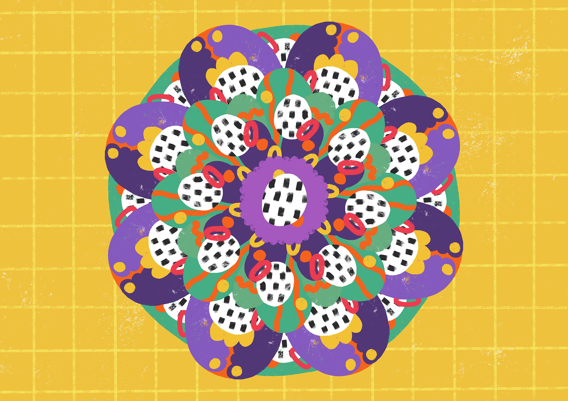
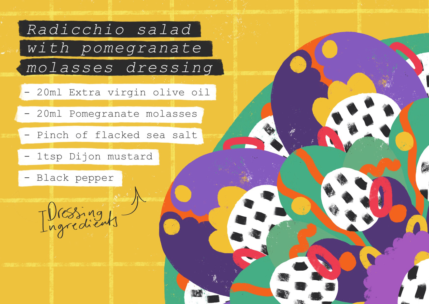

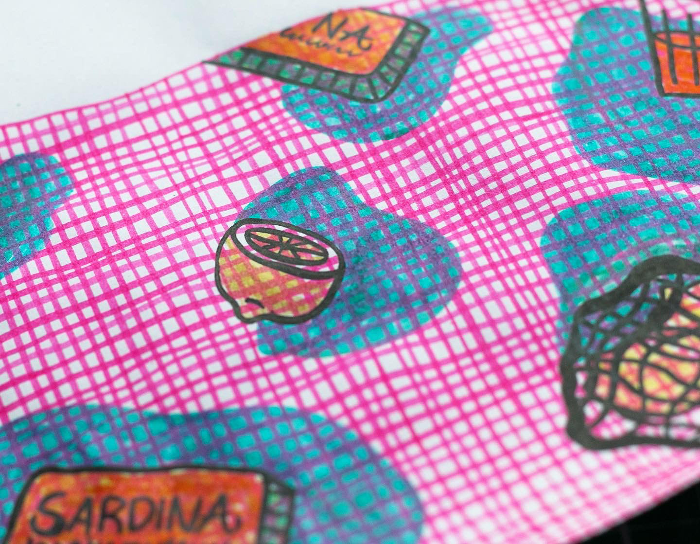
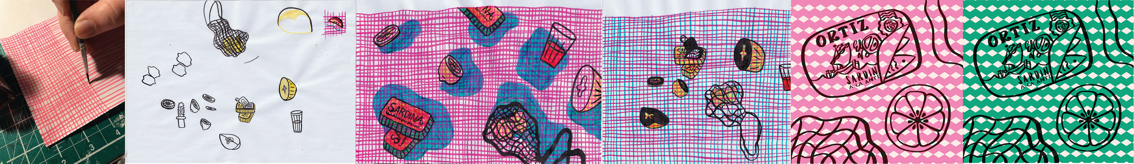
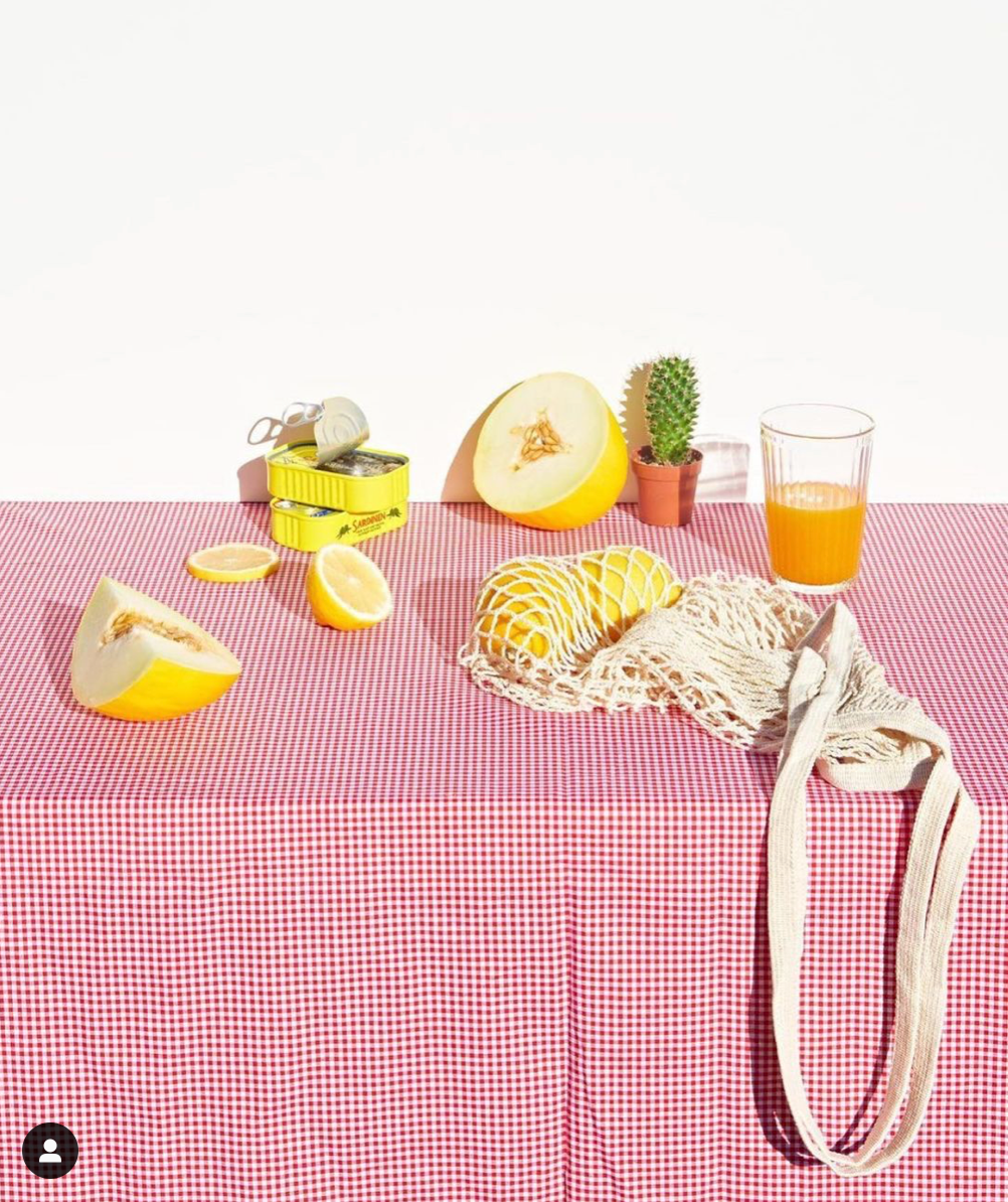
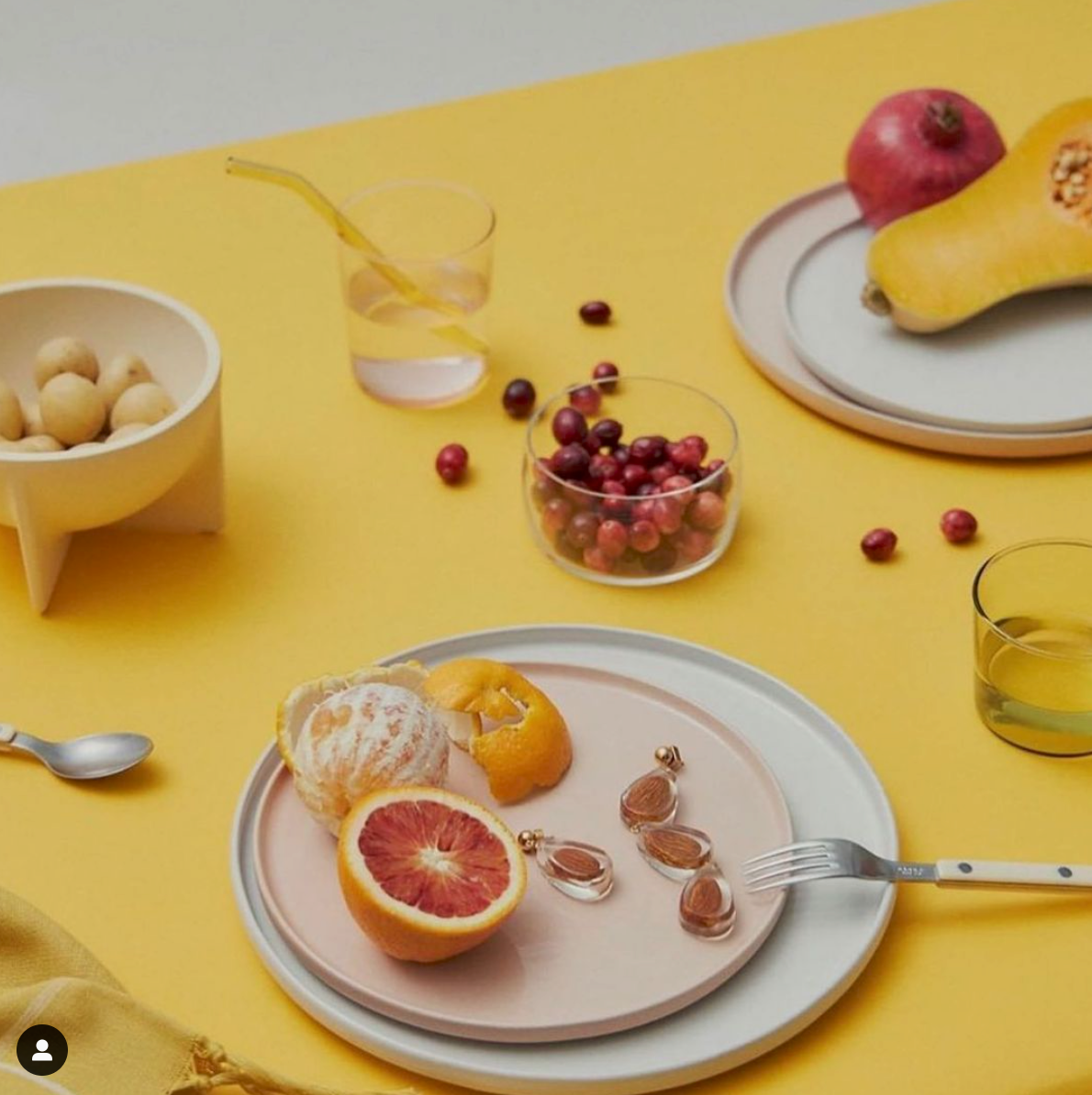
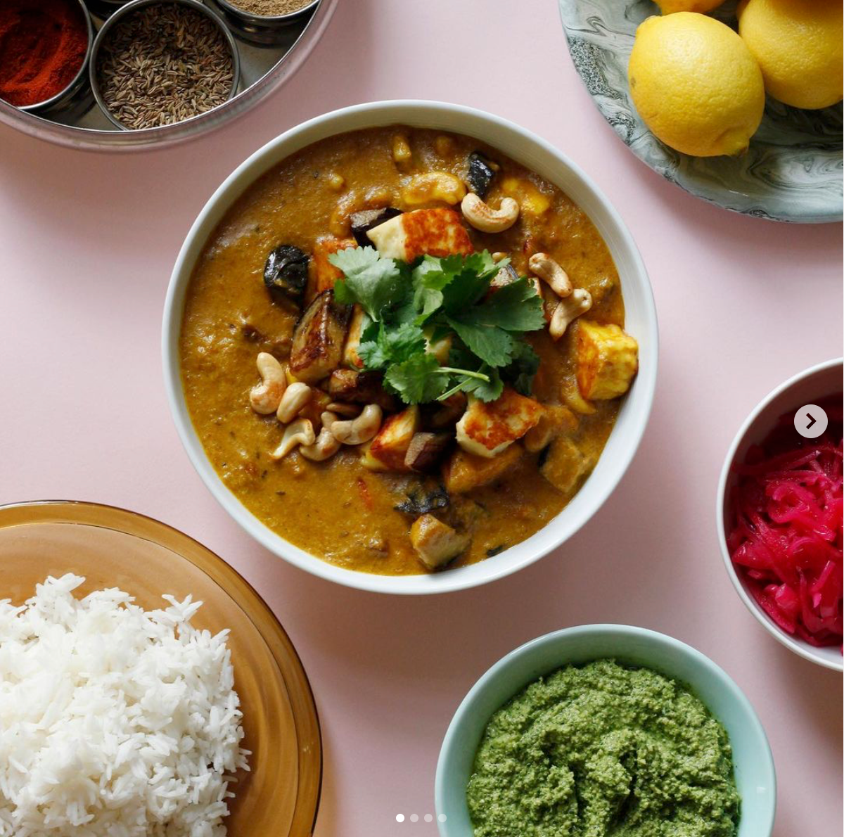
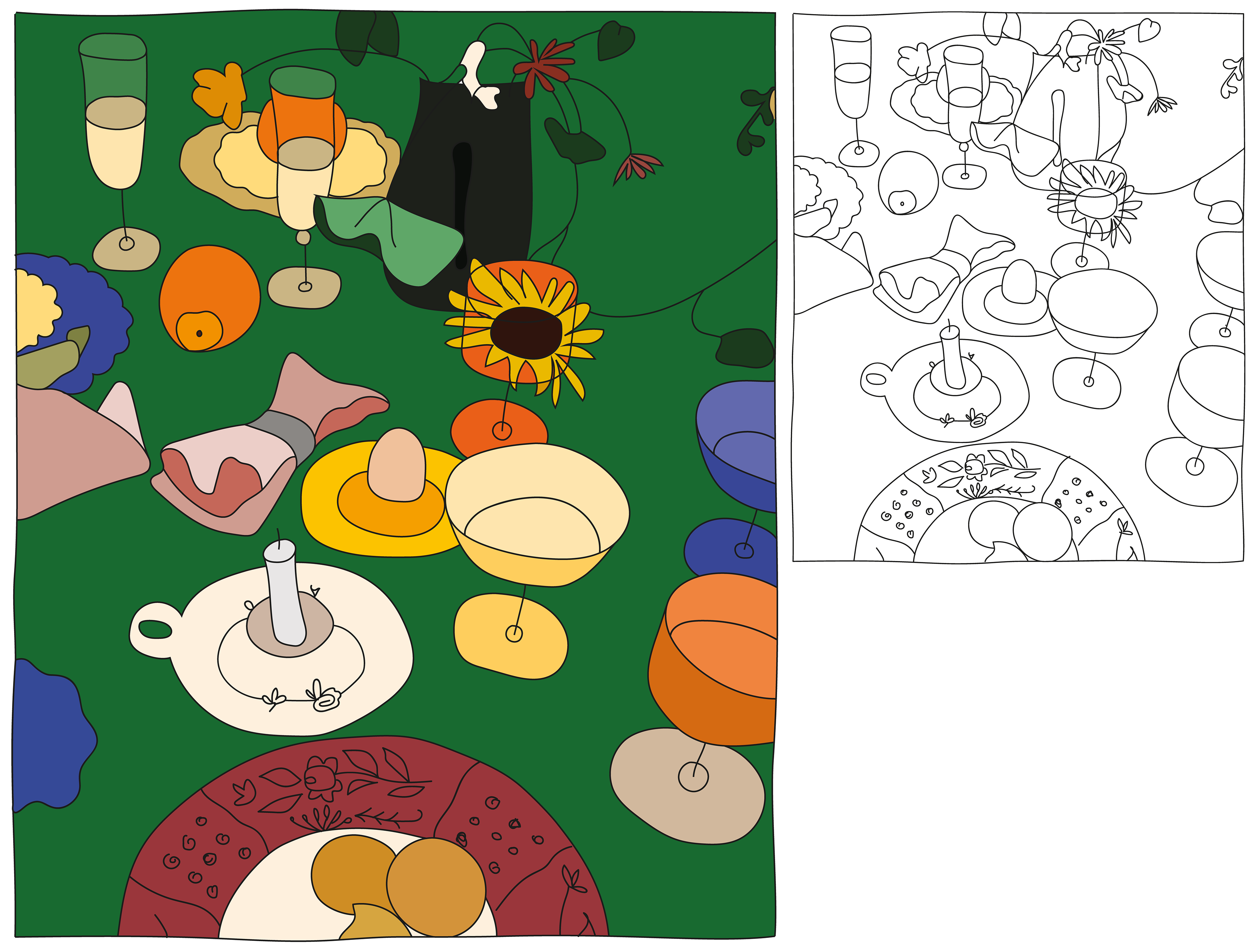
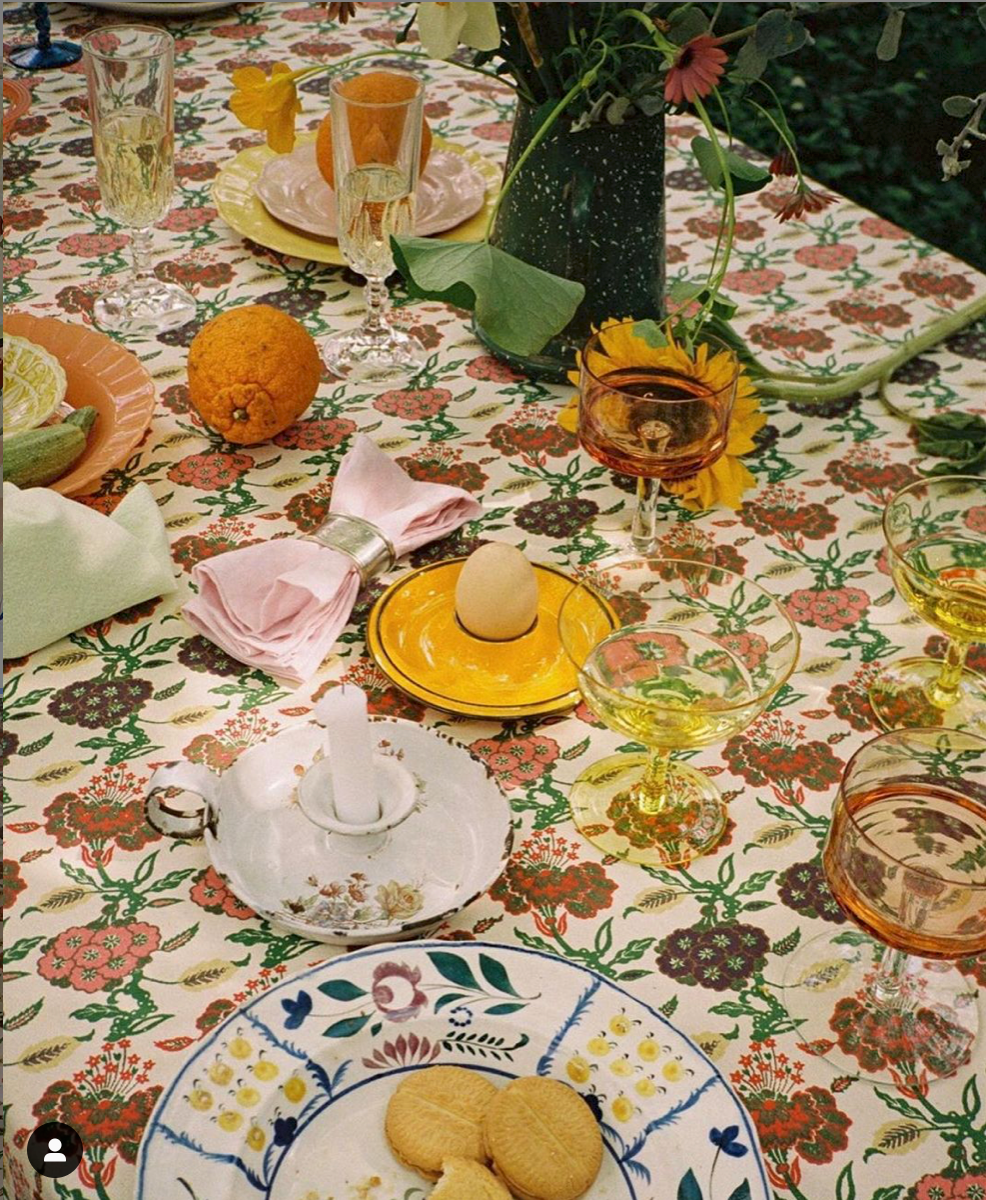
Week 52: Seeing the image for this week, the almost symmetrical compositions and repeating elements, I just knew it would make a great repeating pattern! But I wanted to keep the shape so as to still keep a likeness of the original image.
Taking liberties with brightening up the original colours (which are beautiful, but not quite the shades I wanted to use as they're on the more muted side) and adding in some of the ingredients used for the recipe, I made a little information sheet for all those who may want to make the meal :)
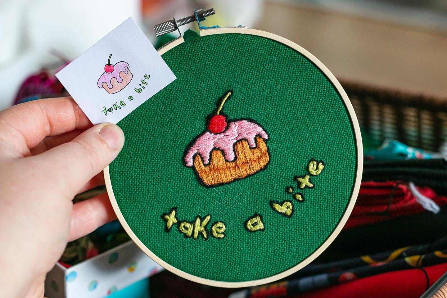
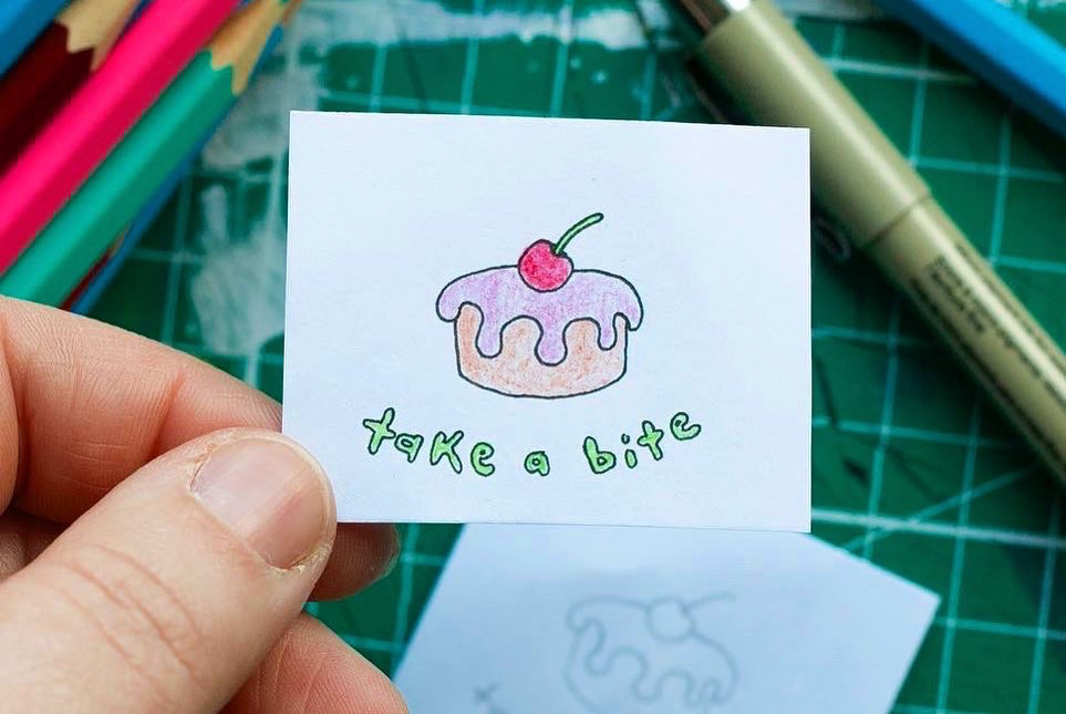

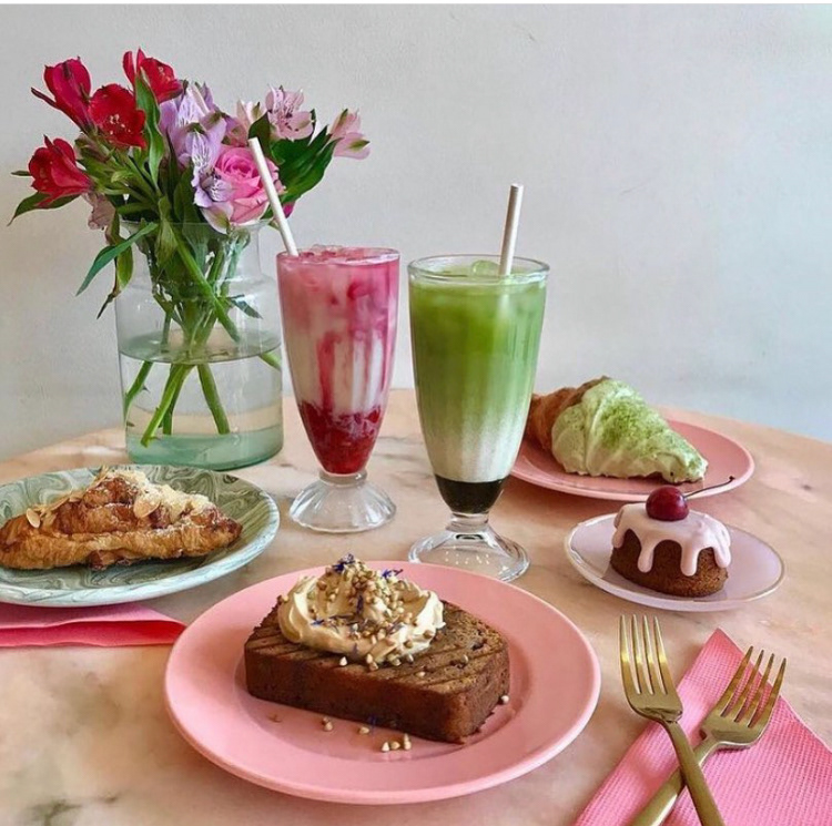
Week 51: Falling in love with the little bun on the mid right, while also not feeling like a full reconstruction of the image, I decided to just follow my eye and make it the focal point.
Needing a switch up of medium I decided to do something I've not really attempted before (not properly). Admittingly I should've looked up a how-to first, but it was so much fun just to follow instinct and stitch away on an unknown :)
Week 50: The original image was so stunning and inspiring in terms of being really different and incorporating so many different textures and elements. Initially I loved the challenged, but struggled towards the middle as I felt my version a bit flat.
This led to some of the experimentation that can be seen on the top right; which in turn (as it always tends to) helped me find an interesting middle of clean and textured line that led to the final outcome. Its also inspired me to pick up more typography, my great love that's been left to the side recently, but no more.
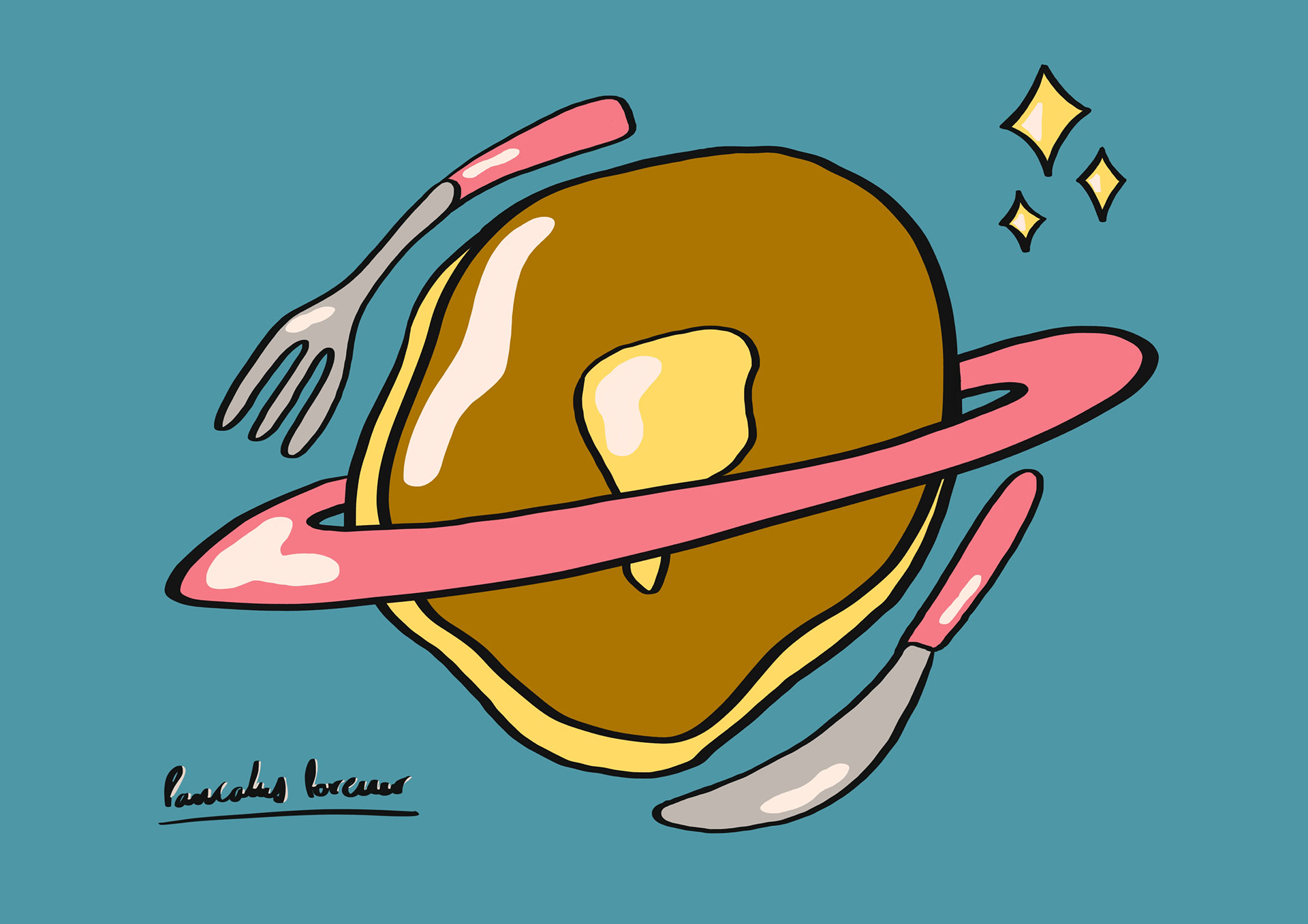
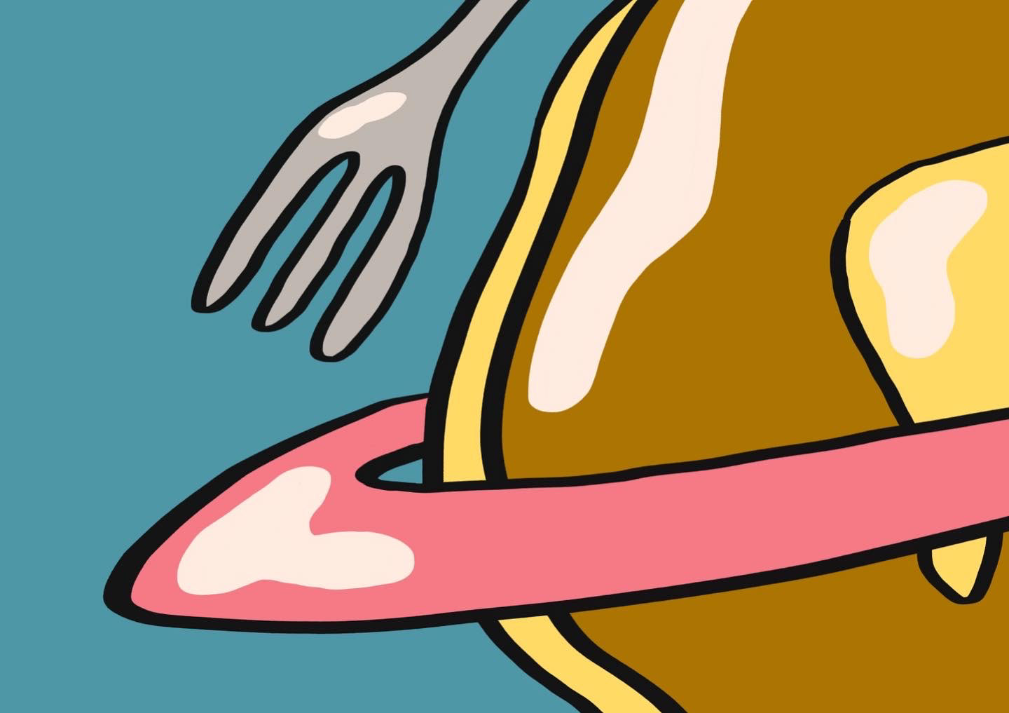
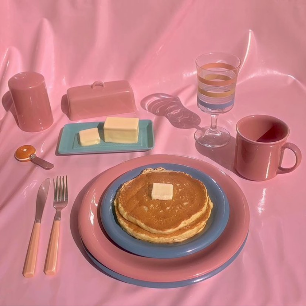
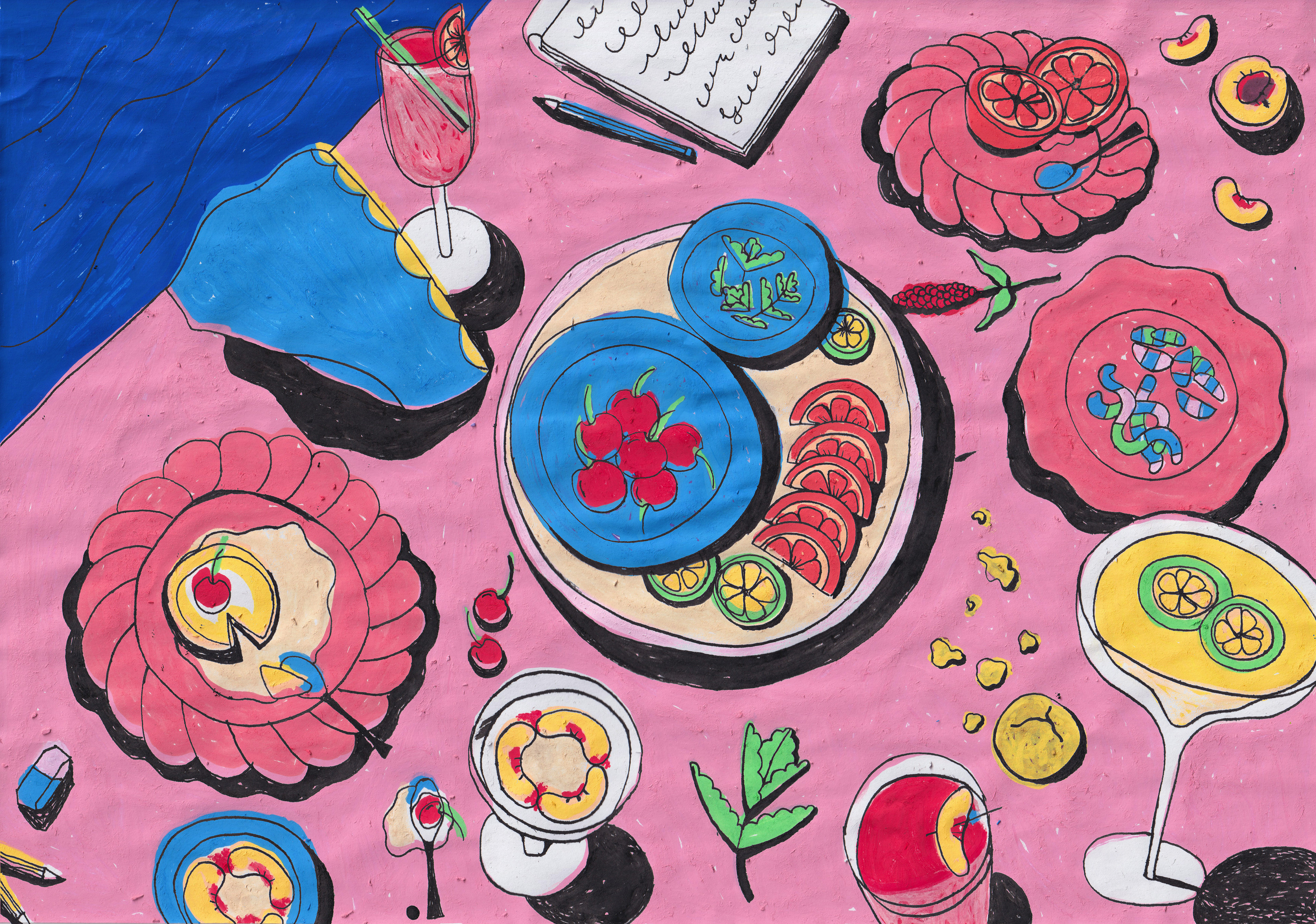
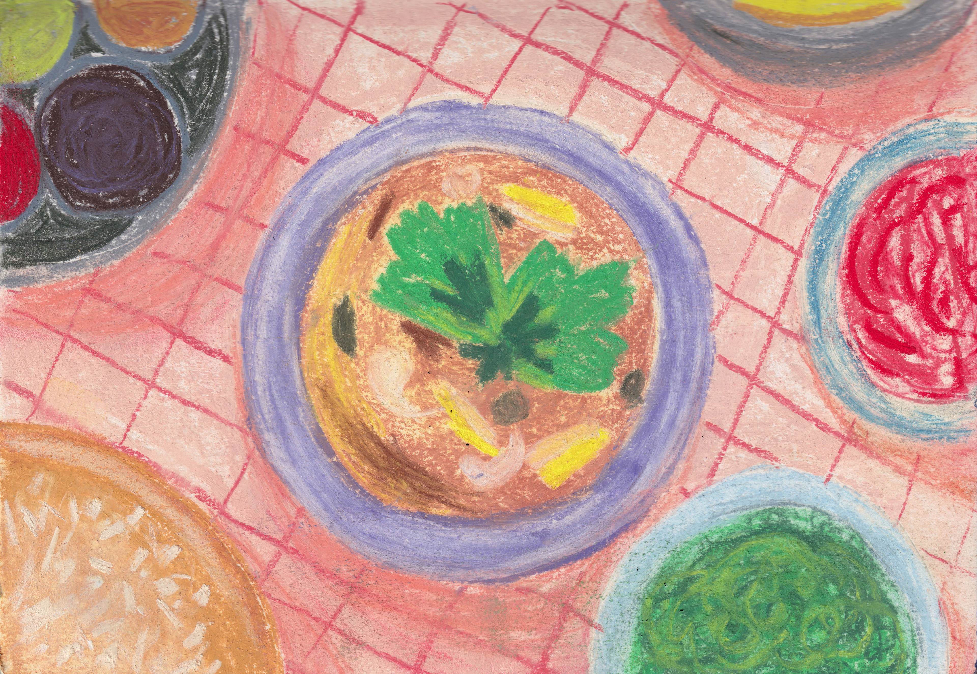
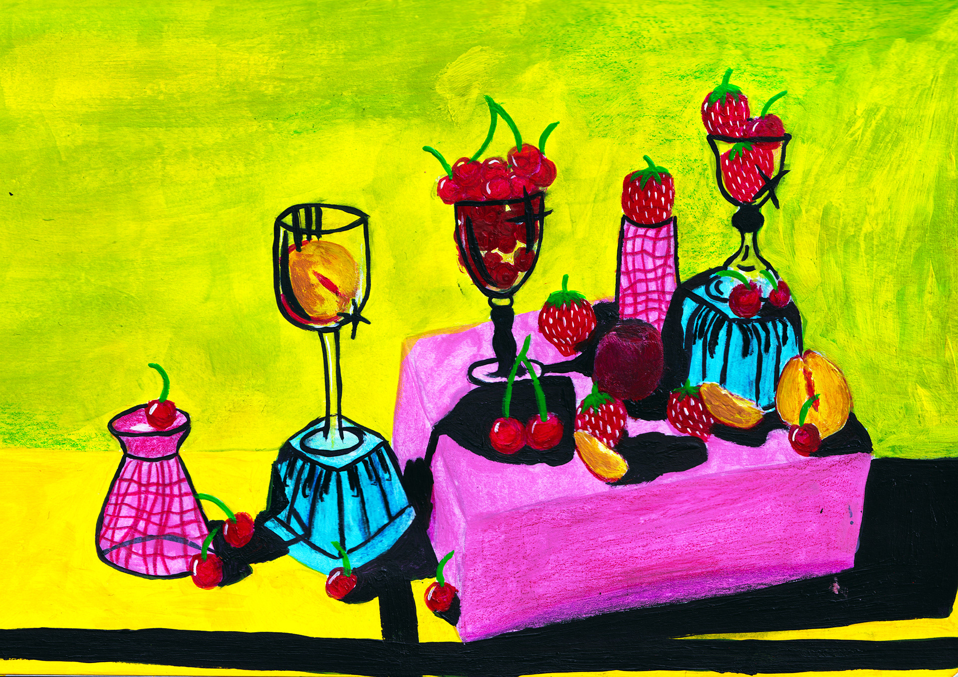
Week 49: Keeping with the pink and blue hype, this weeks prompt ended up being made from my colour palette last week! I do love it though and chose to keep my colours to match as they're a favourite of mine as well.
I did a trial of doing the whole image, but couldn't shake the visual of a Pancake Planet, with the plates looking like perfect Saturn rings. In the interest of having a bit of fun with this weeks prompt I ran with it!
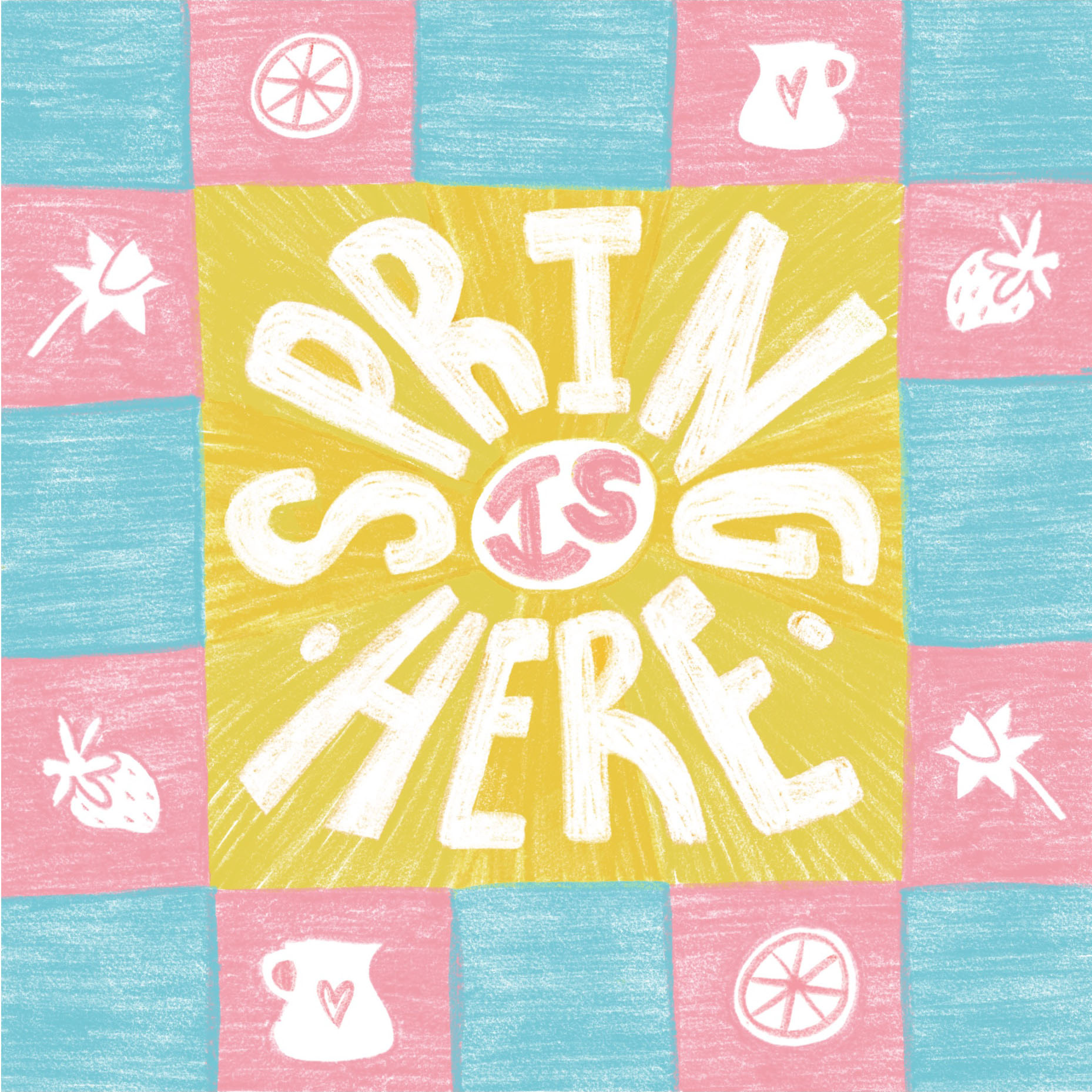
Week 48: I'm a sucker for a bright colour palette, but once you've gone to a 10 there really must be a cool down! The subject matter of spring also just feels really soft, so I wanted to reflect that in the colour choices.
I had a lot of fun using this weeks prompt really lightly, adding in some type and bringing the photographed elements in more as icons than centrepieces. The original being a recreation of real life did prompt me to be a bit looser as a result as well.


Week 47: After having a bit of black and white its only right to return to your usuals 'all the colours' program :)
This one was just so much fun and after a few more time intensive weeks I found this to just be a great mind off, hand drawing time! Over the past few months of doing these I've become such a big fan of checkered patterns, but I think this may be my favourite one so far.


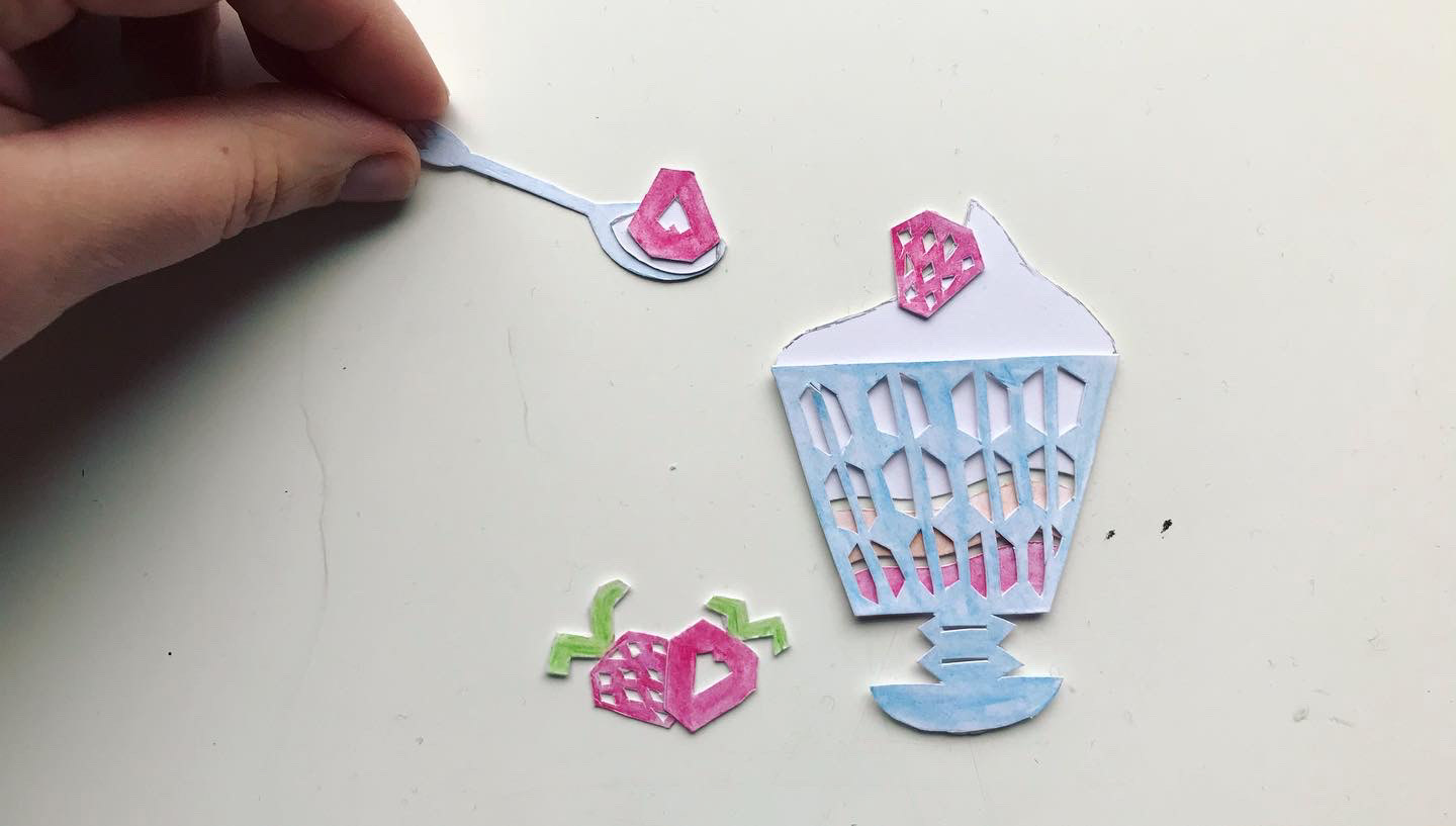
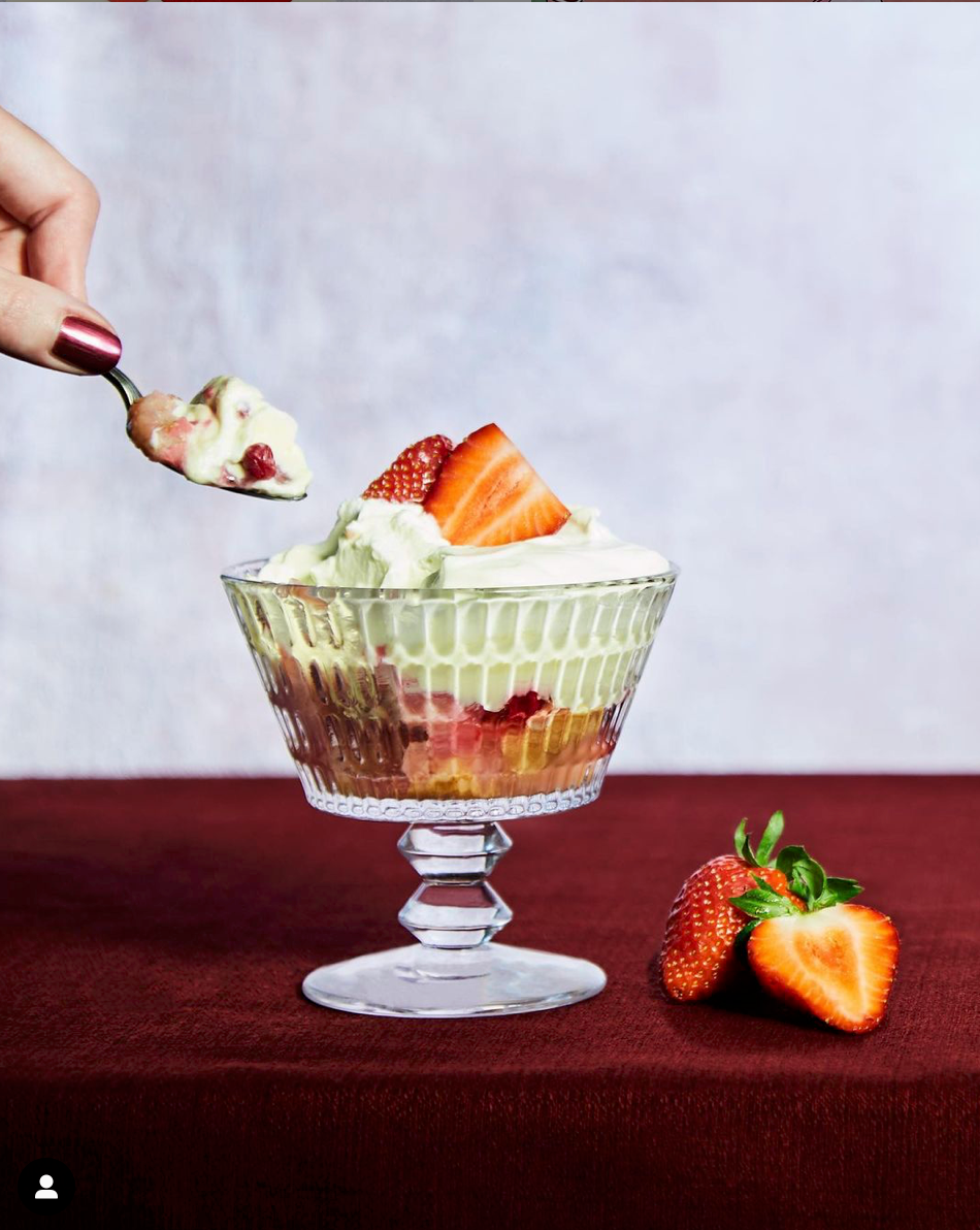
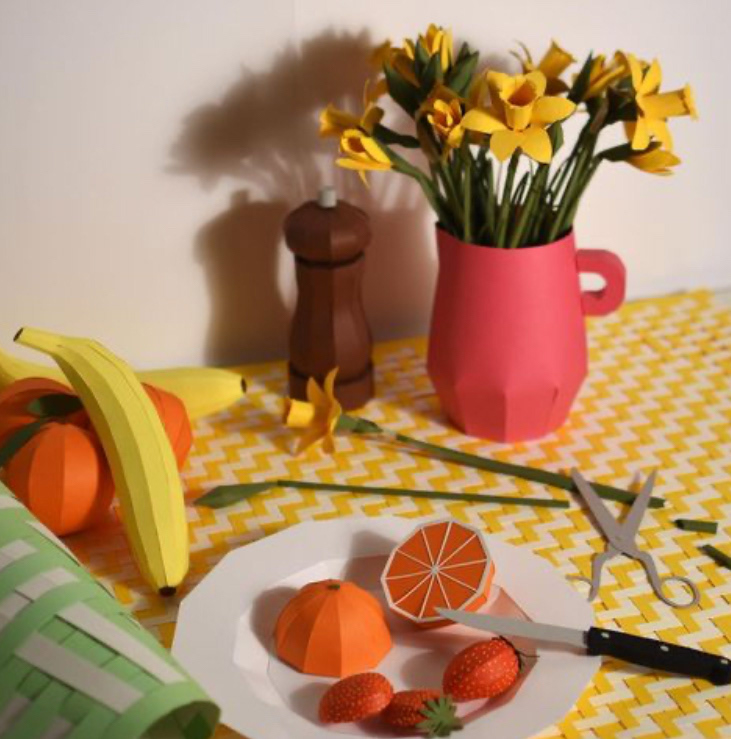
Week 46: I loved the idea of doing this prompt using paper as soon as I saw it! However when I'd done it I wasn't so sure on the colours I'd chosen to colour them and when photographing the 'final' I fully decided I hated the colouring. This led me to loading up Adobe Capture to try vectorising the clippings. By near luck and happiness I loved how this looked as it, no further tweaking needed! However all this moving around of assets to photograph led to a question 'how would this look animated' in the end I had the assets ready. This led to the animation at the top :) I'm so happy I took it that step further and now I've got some insite Adobe Capture may just be used again!
Week 45: Finding some of my inks in the week I knew it was time they were used for this weeks illustration! I'm not too knowledgeable on how to use inks (other than black) so it was really fun learning how they combine - with my favourite bit being how the lighter colours multiply over each other and shine through.
I've included some of the whole sheets of illustrations to show the full scale of the trials, even though it was the more zoomed in shots of elements that I preferred. See the bonus little digital versions too :)
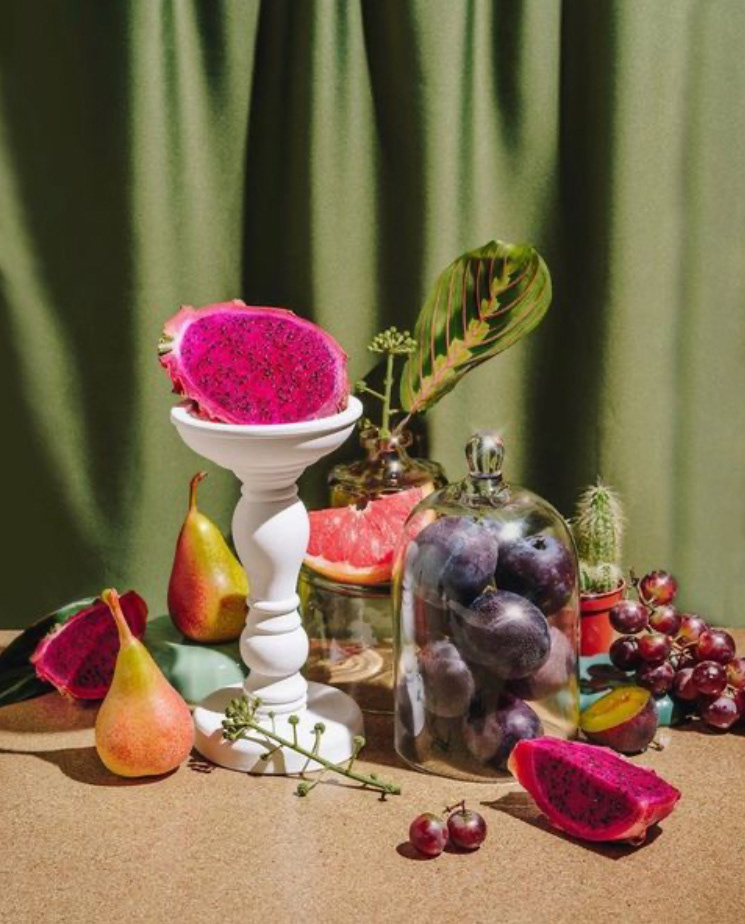
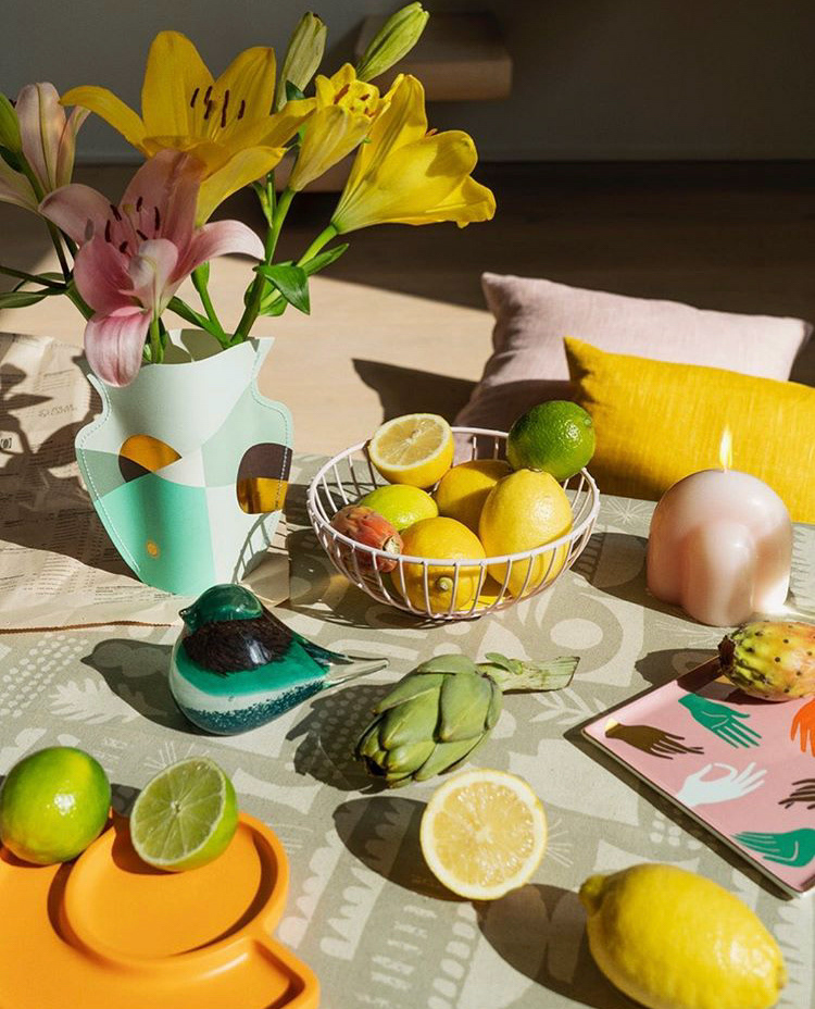
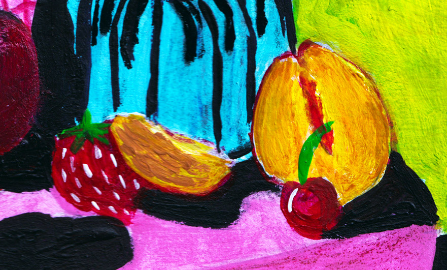
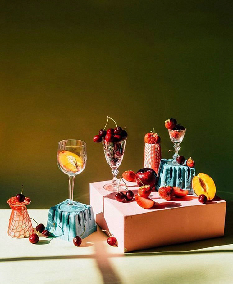
Week 44: Taking things a bit more sketchy I started on this during a rainy afternoon when I needed a lot of colour! I wasn't particularly in love with the green background of the original, but loved the fruits colours all together so just added a bit of blue to give it the one shade I felt the scene was missing.
This was such a dynamic image and yet another interesting puzzle. I'm really starting to love Procreate! Although doing pieces by hand will always be my love, its nice to have some of the freedom of choice digital drawing gives (in terms of materials), although I try not letting it become a hindrance as complete freedom of choice sometimes can be.

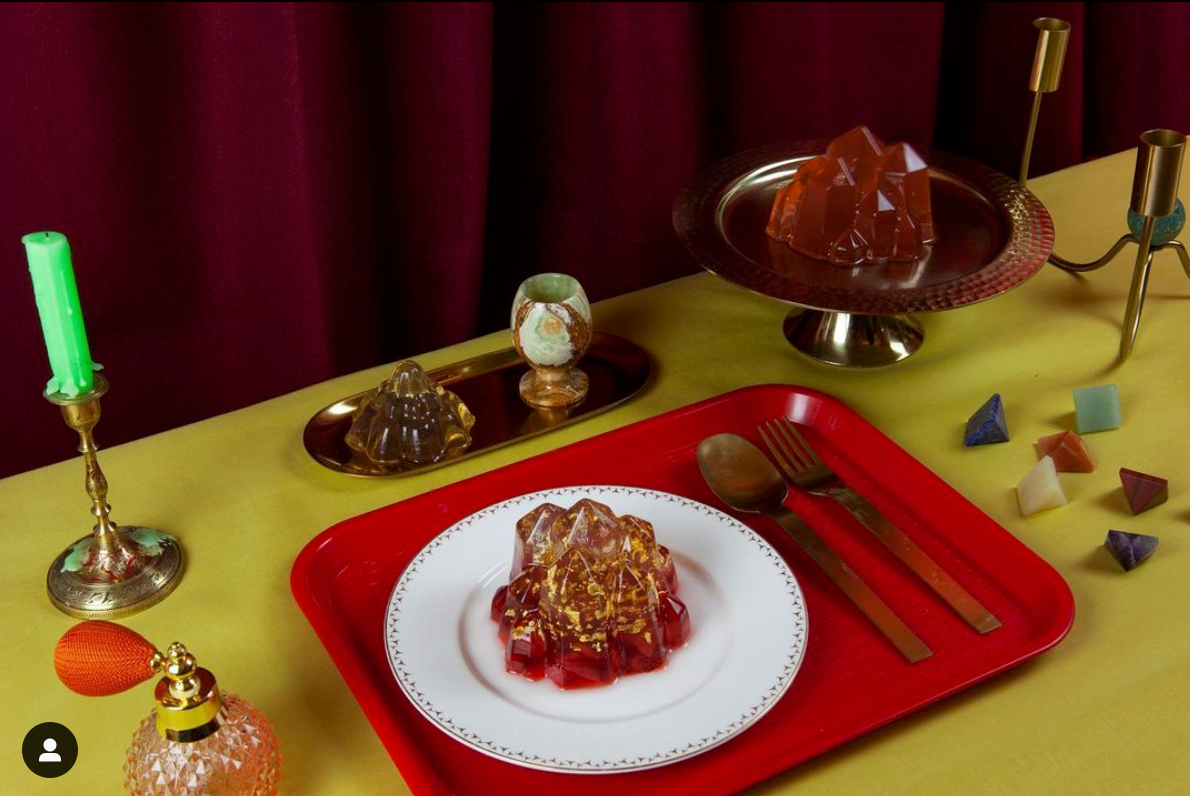
Week 43: This week was so much fun! After a few still outcomes I was craving some animation and this prompt was just perfect as with its magic feeling it was time to make flames! I added glowing elements to the crystal looking jelly and floating stones so as to further sell the etherial feeling and get some more life into the scene.
This was a bit of a different colour palette to play with, but kind of nice to move away from all the colours for a week :)

Week 42: I think this week was the most indecisive as of yet. Although I want these to be free flowing fun, I deeply hated the first few attempts - they just didn't look right, have the right colouring, feel, thing I wanted. This led to a few scrapped versions and further experiments.
I guess this is as with everything, things don't come out quite as hoped, but that leads to unexpected (and occasionally far better) results.
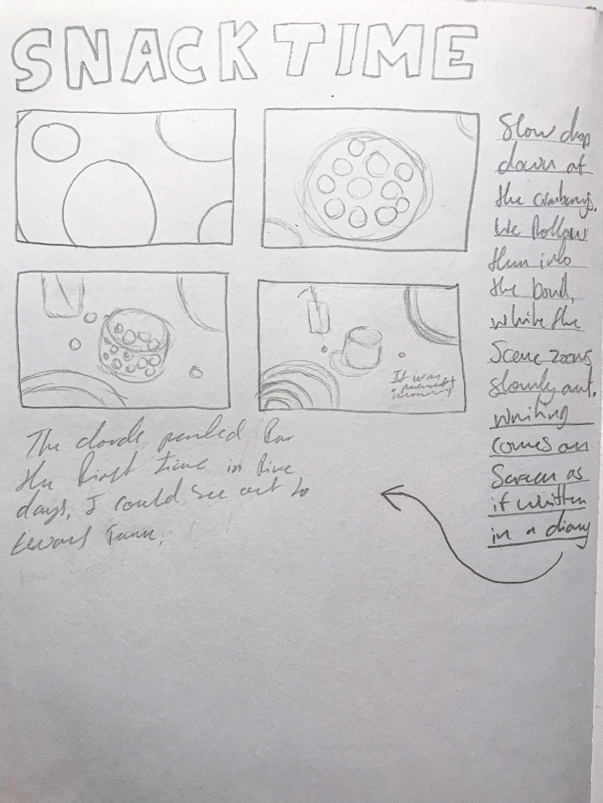
Week 41: After making a bit of a complicated illustration for the previous week I felt like making something a bit more simple. I toyed with the idea of making an animation, which went so far as being drawn out in storyboard form (as seen above) but when in Procreate I ended up changing my mind, settling for just the still as it seemed to come to a natural finish. I really loved the process of making this one, having the reference on my laptop opposed to the screen as the previous illustration. I intentionally left off the smoothing effect for the brush so as to add to the rough hand drawn nature.
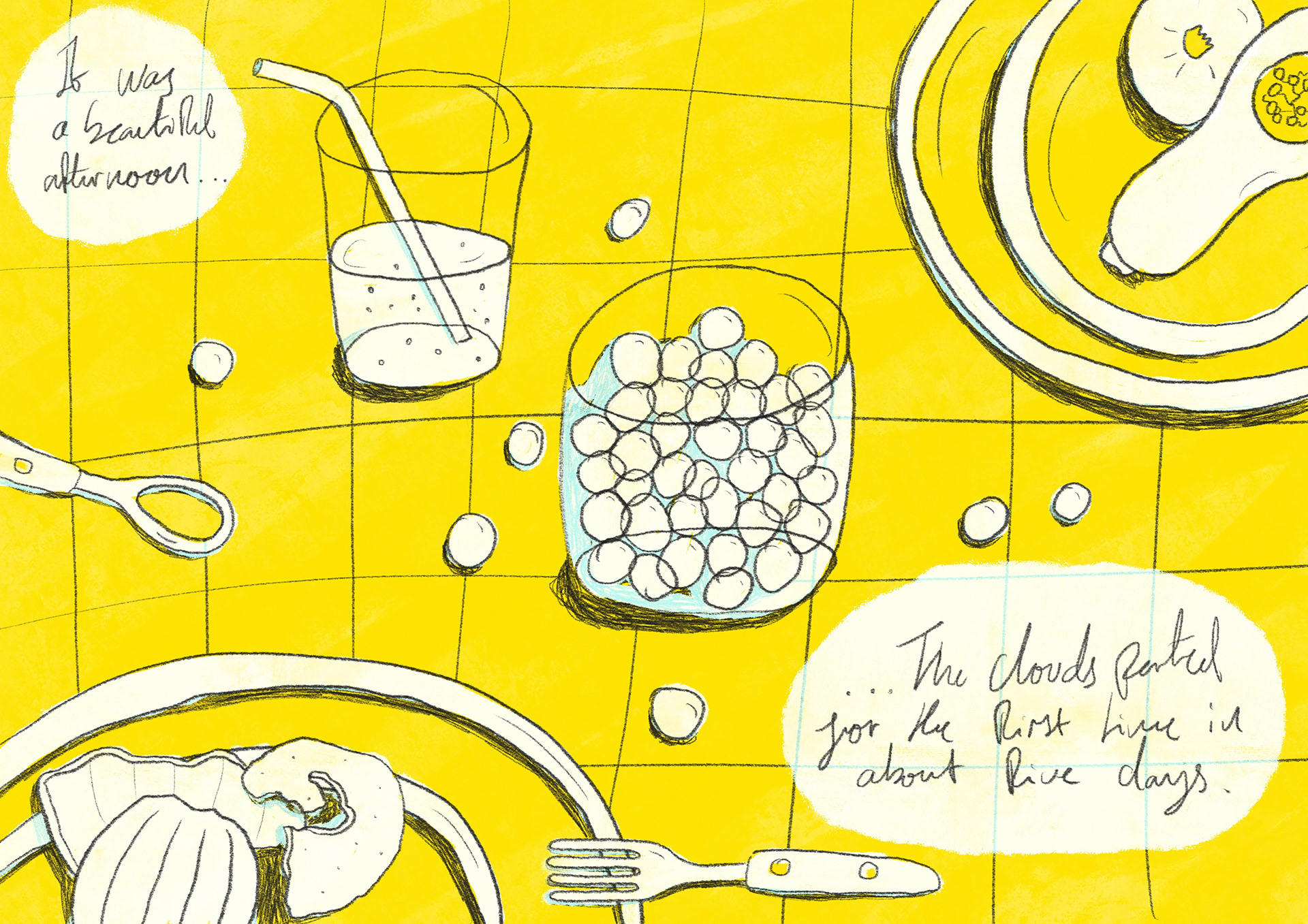
Week 38,39&40: I didn't miss a week (or 3) but they took some time off over Christmas and New Year :) After having quite a few weeks of hand drawn illustrations, I followed my feelings and charged up my pencil for it was Procreate time. Since I was last on they'd updated and I used the Reference feature in order to get a close a resemblance as possible. I chose to deviate with the colours when it came to the background as I could just vividly see a light blue suiting the rest of the colours in frame.
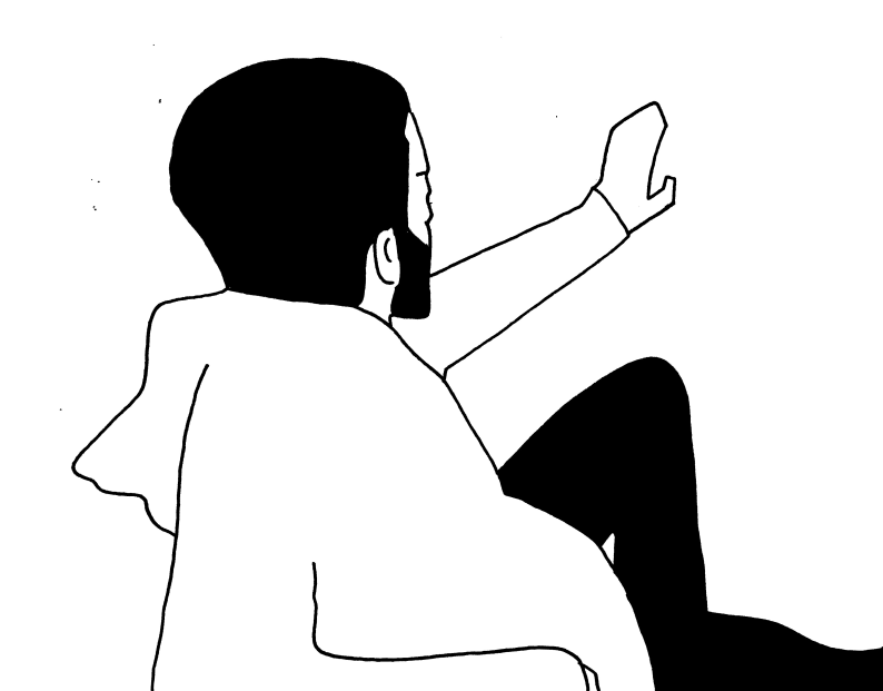
Week 37: The idea of having my little creation (Colin) behind all the miniatures appealed heavily to my humour, so I decided to take the prompt a little looser and worked on creating a Gulliver's Travels esk scene. I'm not prolific at keeping solidly to perspectives, but kind of like how the blend of more dimensional and flat balances together.
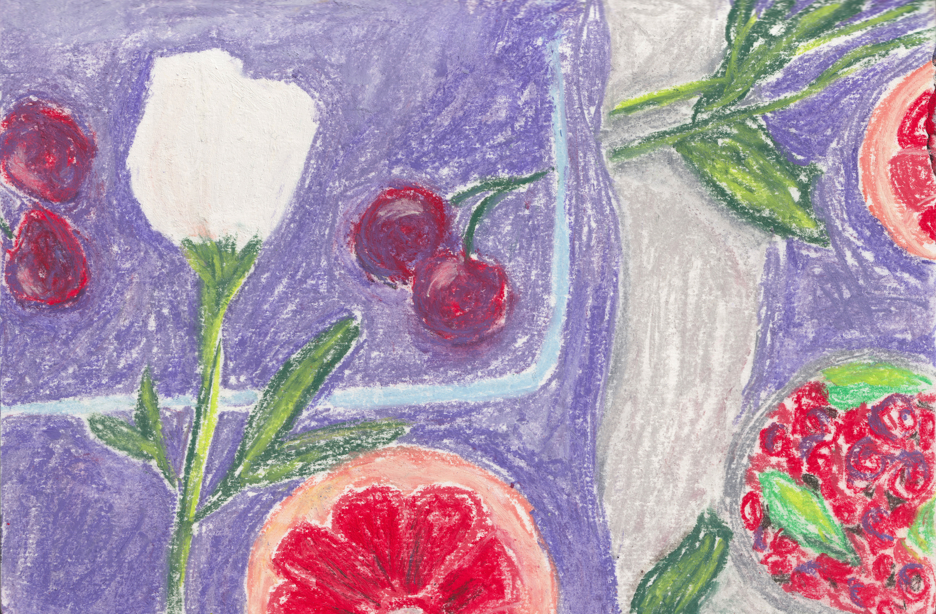
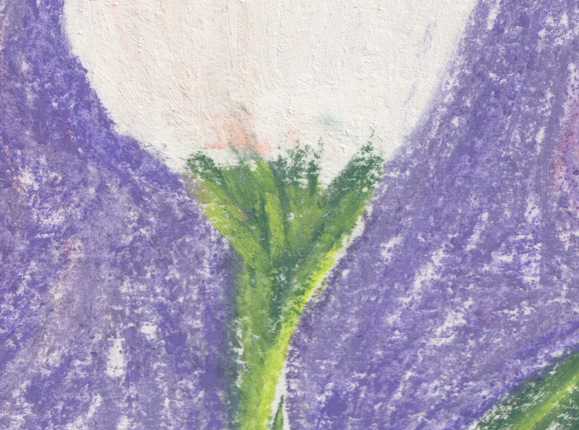
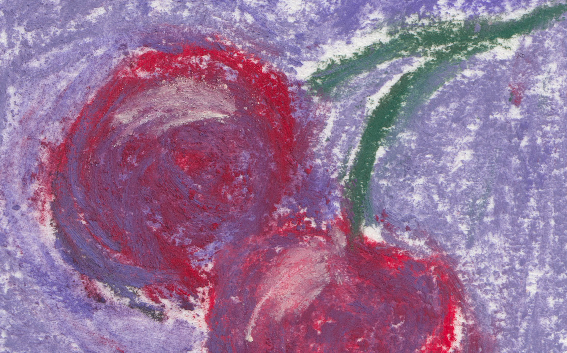
Week 35: Absolutely loving the previous pastel illustration I was a little obsessed and on seeing this weeks prompt I knew I had to do another as the whole feeling and look (in my mind at least) screamed for the softer look. I feel as though I may have been a little heavy handed with the combining of colours, but I really love how the white rose and some of the leave turned out.

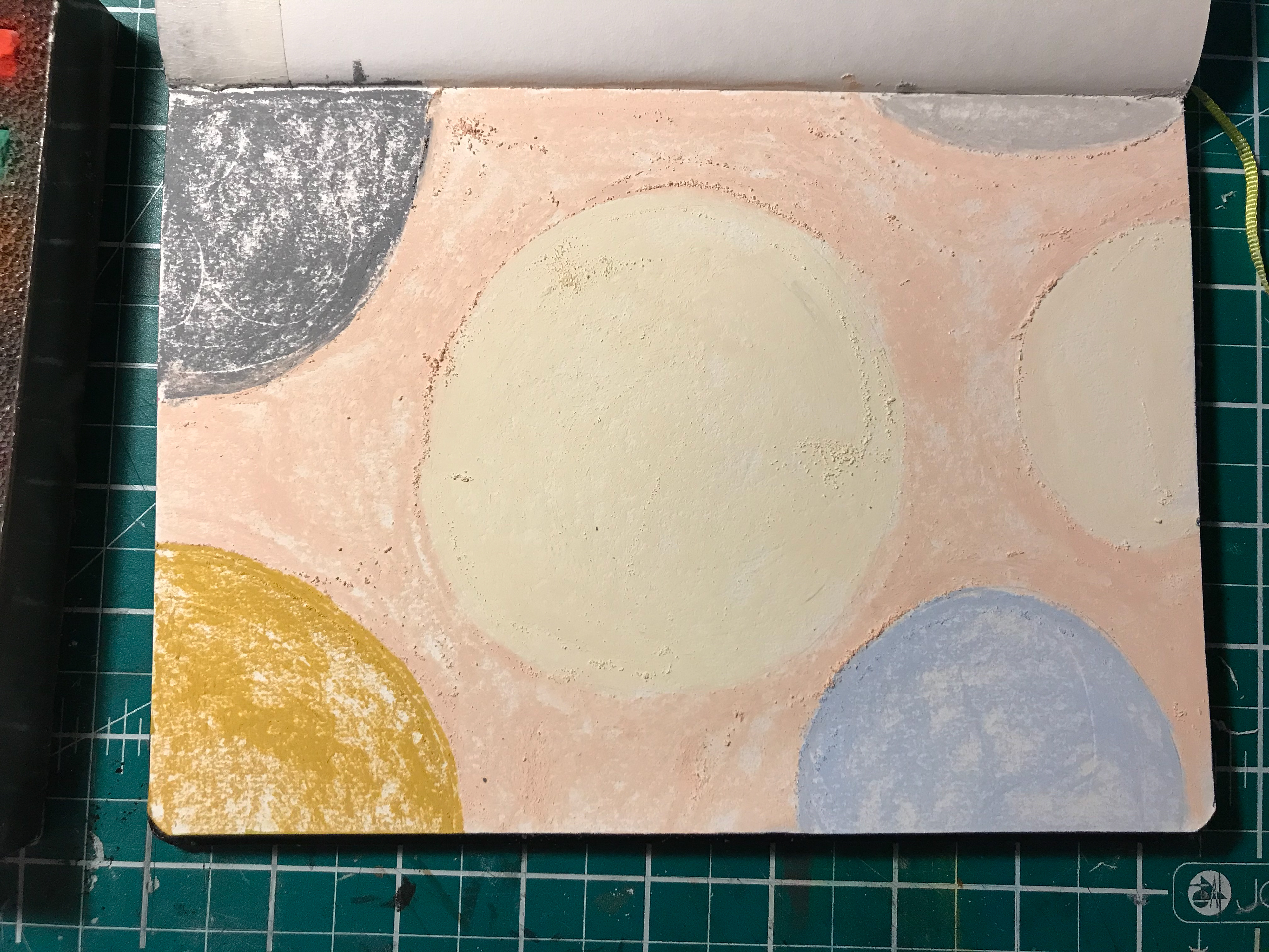
Week 34: Wanting to mix up mediums a little for this week I dug out and got to using my coveted pastel collection. This meant a lot of dust, but some beautiful textures! I’ve included two process shots from early on in the layer building process because I just really liked the colour combo and excited to use more of this process in the coming weeks :)
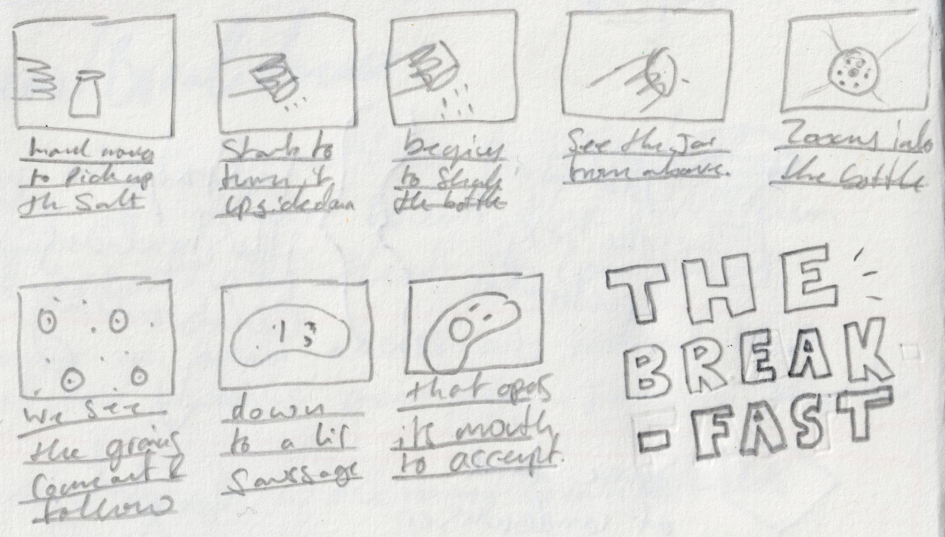
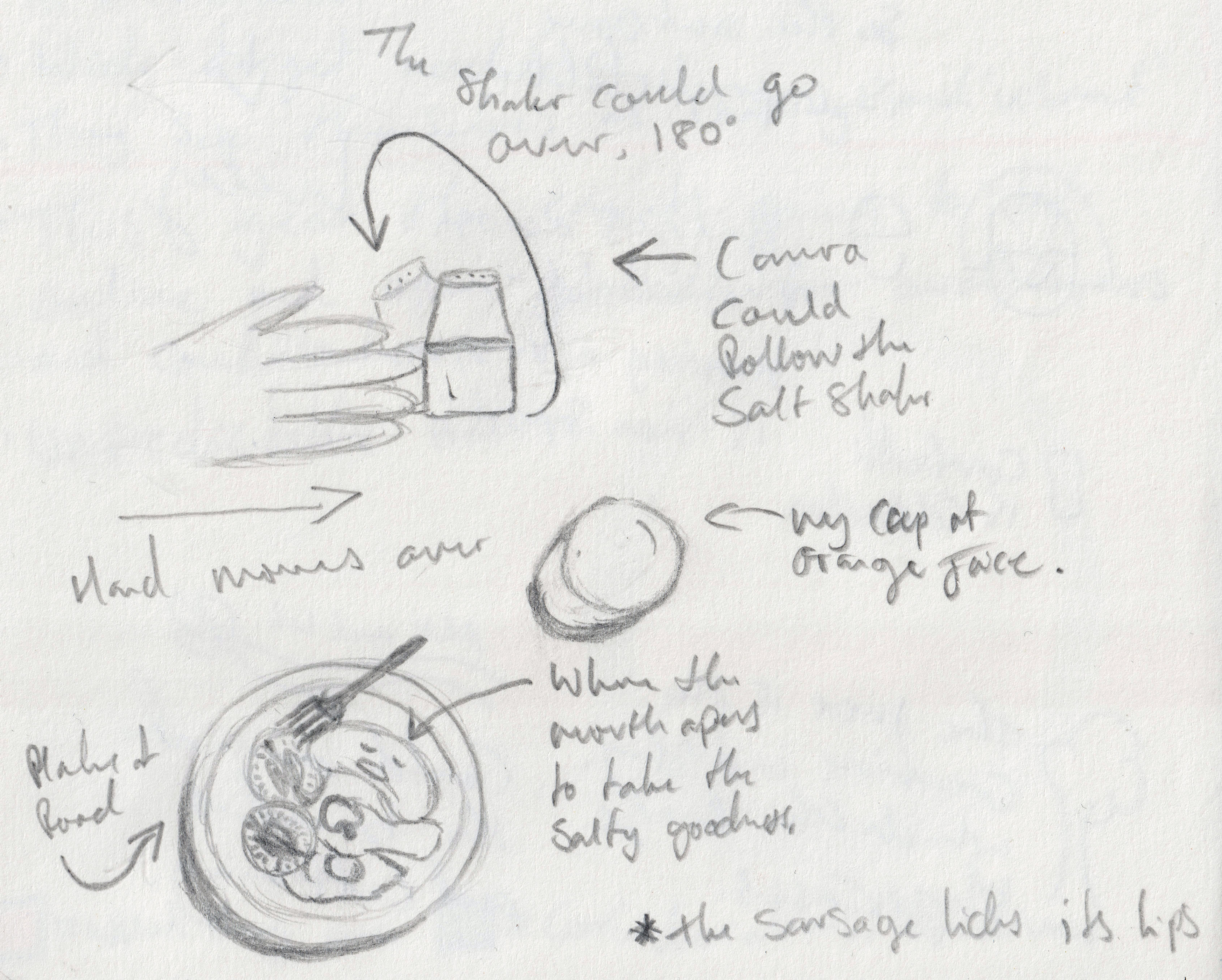
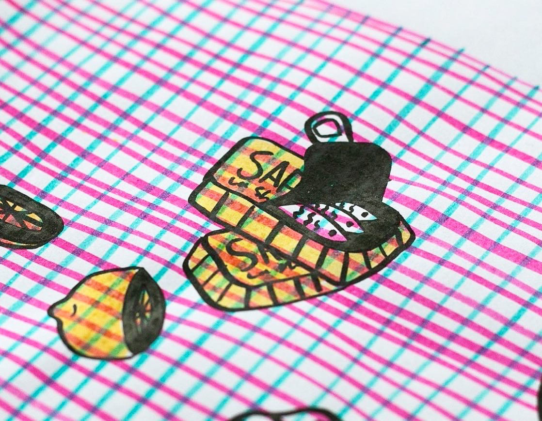
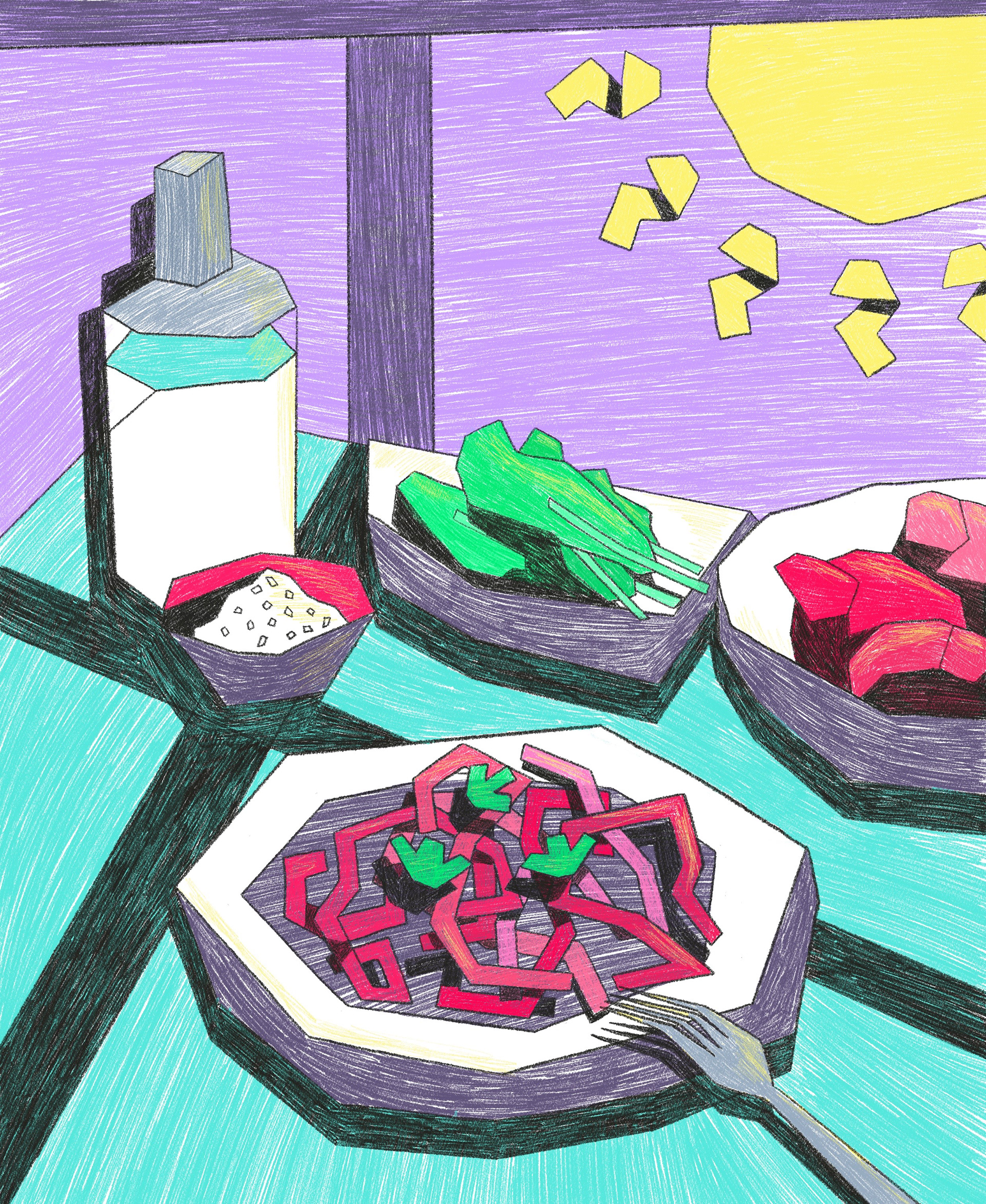
Week 33: I was a little stuck when I first saw this weeks prompt, normally I get an idea what would be cool to do when seeing the image, but this week not so much.
After a little sit down think I came to the conclusion that I really felt like doing a bit of animation and as I want to work on introducing some more dynamic shots/angles, but it bends my mind a little, I decided to just go for full wonky angles and bendy fun anatomy. This is inspired by a talk I saw about how animation makes the impossible live action shot possible, so here I storyboarded how the shots could emphasise salts journey with a twist.
I don’t think I’ll ever fully stick to proper proportions, as it’s too much fun to play with the other ways, but I do want to work on getting more consistent, with the possibility of perfectly neat if the brief called for it.
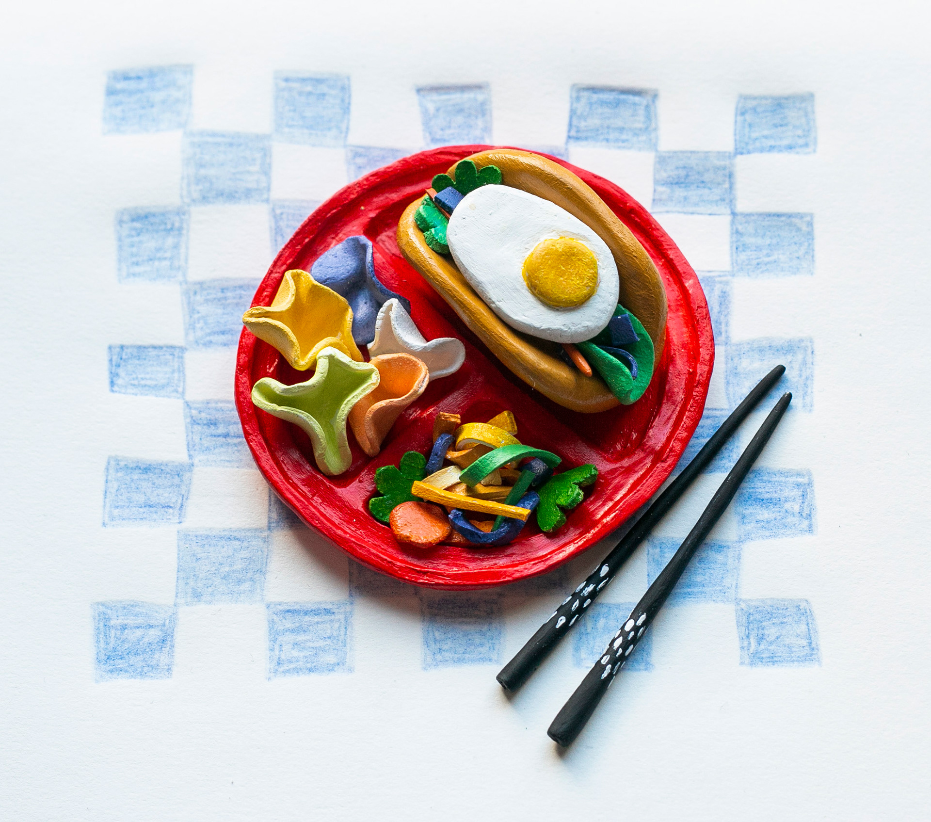
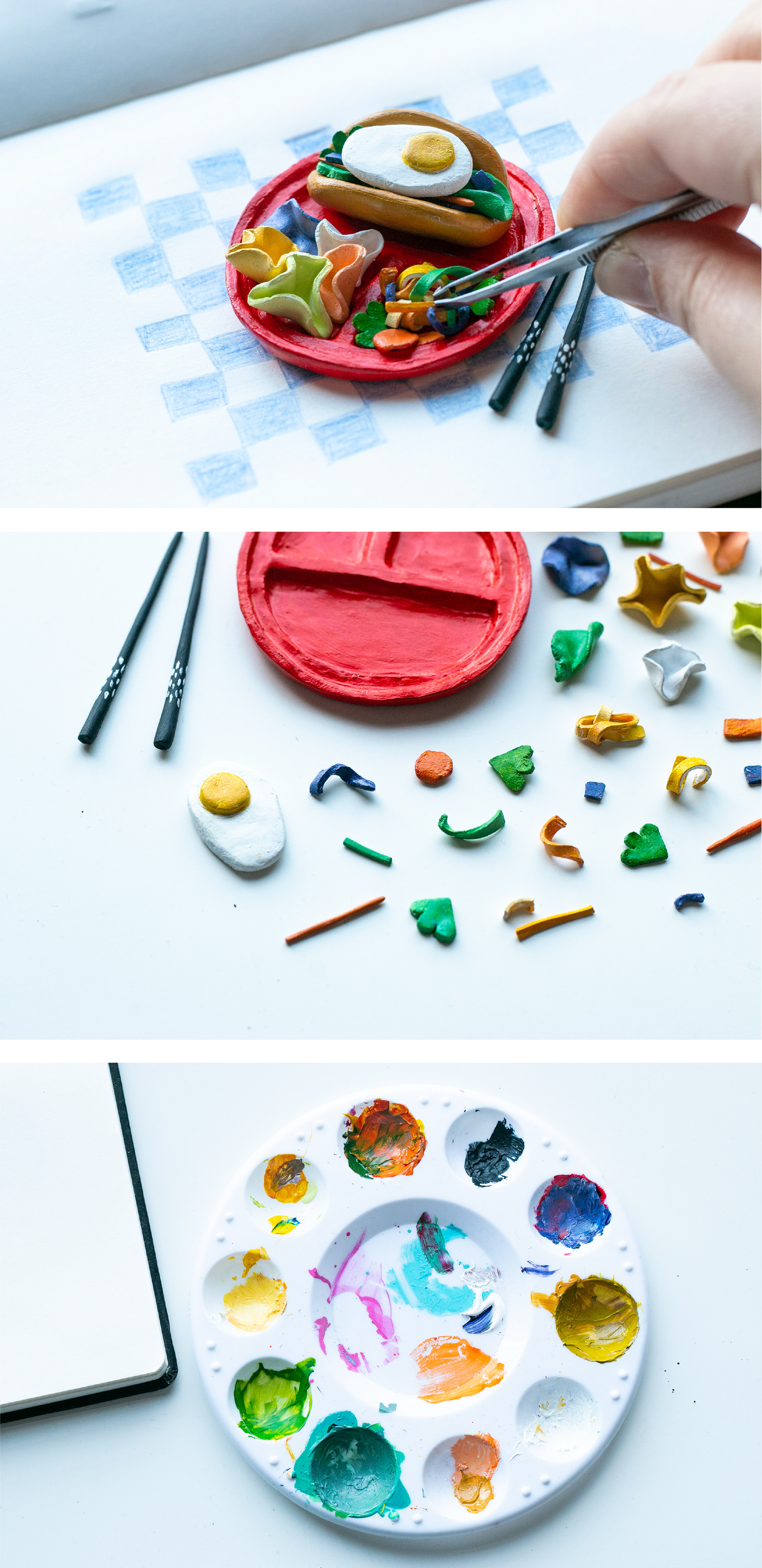

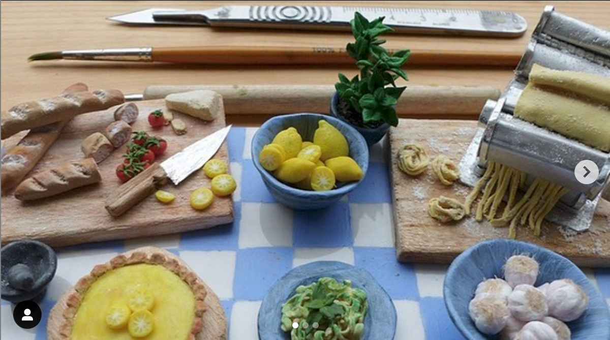
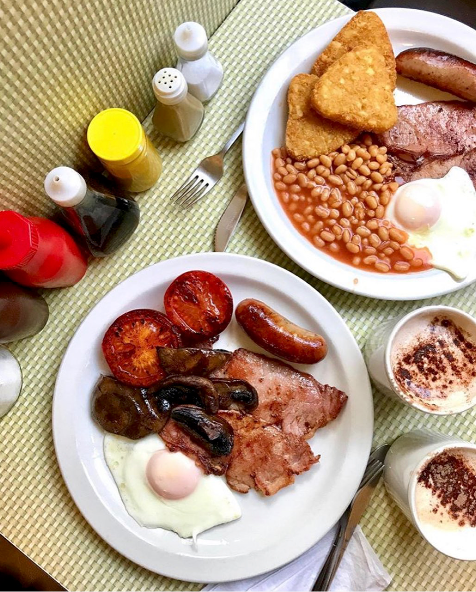
Week 32: I've been obsessed with miniatures for as long as I can remember, with Polly Pockets being a long time favourite (and still coveted today). When I saw this weeks prompt I knew I HAD to make it.
Getting my clay out I worked out the series of elements I needed to make and paint in order to recreate the meal - absolutely loved this week! The making process lasted a few days due to drying time of the clay and when painting.
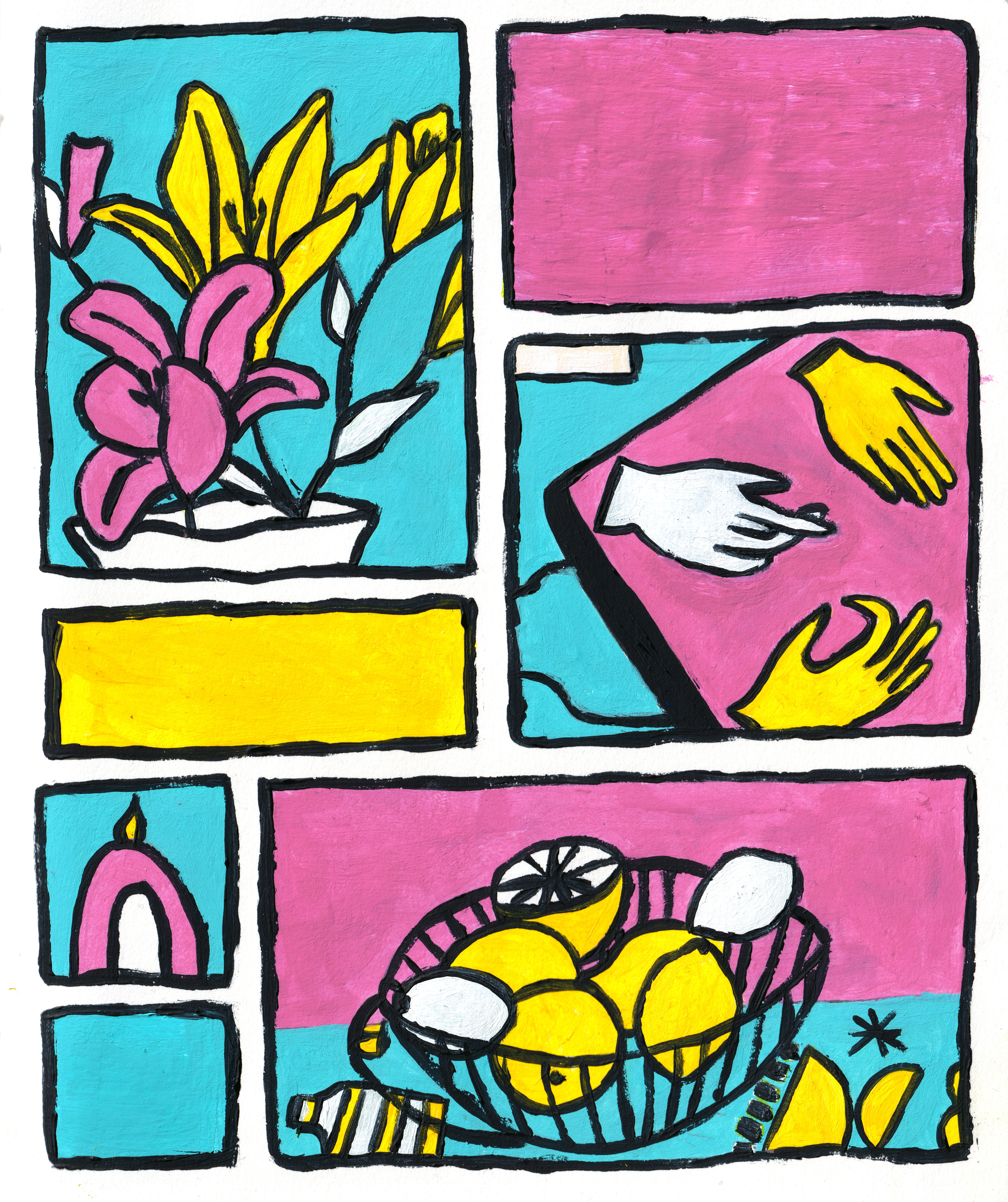

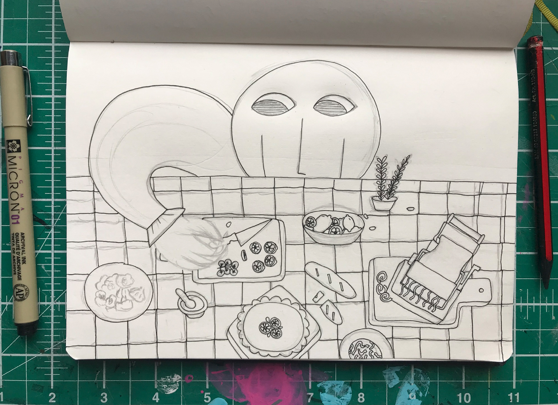
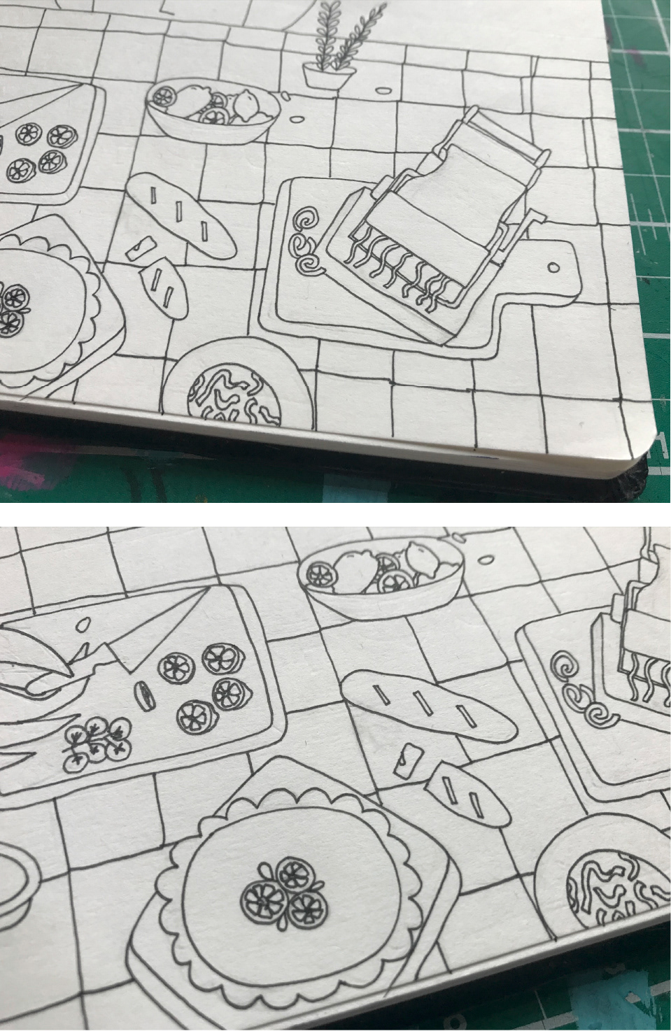
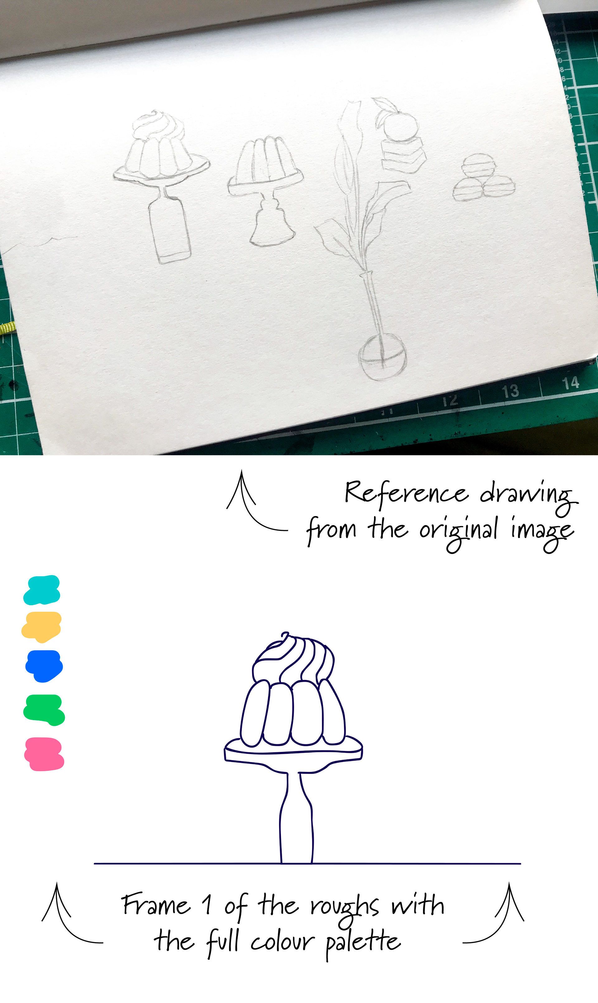
Week 31: Following a gut feeling that this weeks still life would be really cool as separate, almost comic like, panels I began with sketching out the forms and then going over the lines with 0.3 fine liner.
There are so many beautiful shades, but as the overarcing shades were in the realm of pink, blue and yellow (along with green, but I didn't like this in the mix with the other 3 colours) I chose to just use these so as to have a limited colour palette.
The original outline was going to be a thin black, but as I was putting it on I really liked the look of a few of the ticker rougher lines, so I went over the piece again to get this semi-uniform.


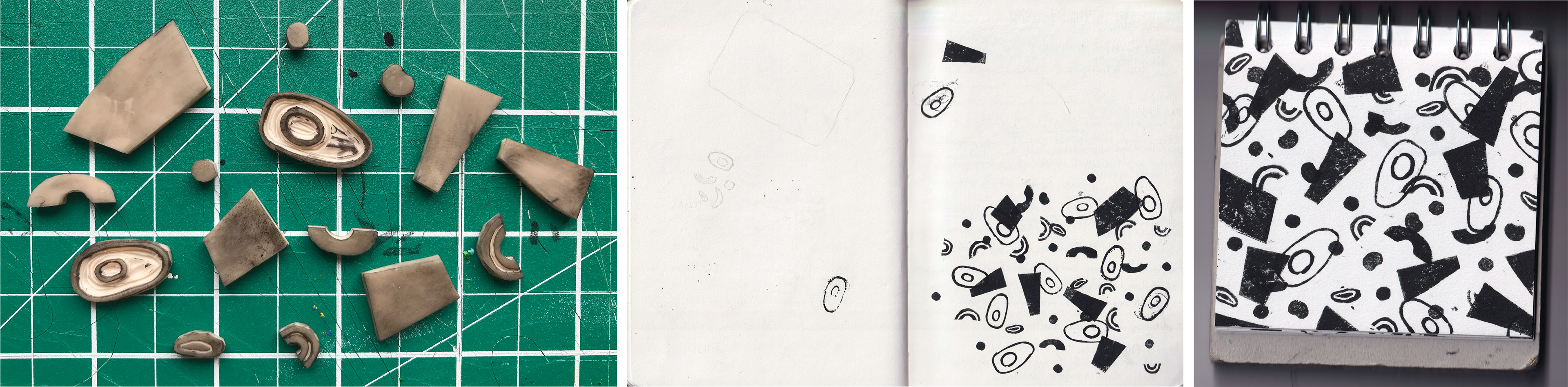
Week 30: Inspired by seeing a lot of abstract renditions of the previous still life posts, I though this weeks image would be perfectly suited to doing a bit of Lino cutting and printing.
To get the final print (top 3 images) I trialed a few different iterations of placing the newly carved shapes to paper - with some being more successful than others! I loved messing with all the different variations of combinations and might have to bring this technique back some day for a future prompt :)
Week 29: Feeling in the mood for some animation (and also wanting to get better at Animate) I decided on seeing the weekly prompt that this would be the week for some movement.
Using a combination of my sketchbook, to get the forms for reference, and Adobe Animate I made the animation in 3 steps: 1) I made the roughs to check movement 2) Edited and shifted frames until I was happy with the timing 3) Went over the lines and coloured in using a pre-selected colour palette.
This was a great practice for further animation, and I've no doubt that I'll be doing something with animation on a future prompt.
Week 28: With the previous two weeks being so focused on texture and the hand done, I though I would shake it up this week and make a completely flat vector drawing.
It was made using the Paintbrush on Illustrator as I didn't want perfectly straight/curved shapes that would come with using the Pen Tool.
Colouring using the Paint Bucket - after making sure all the line points met so I could accurately fill where I wanted colour - I chose the initial colours from swatches on the images you see to the left. I added blue to the composition last as I felt it really needed another colour to draw everything together.

Week 27: So this week I was really inspired to put pencil and paint together, handling colours that were more vibrant and solid opposed to the previous week.
Bringing out the draws of paint I littered my desk and side table with ALL the colours and started playing! I'm really glad I took pictures of the process this week so I can share some of these steps. I did NOT do things in the easiest way it could've been done, but it was really nice finding the piece by painting over segments I wasn't happy with, or wanted to change.
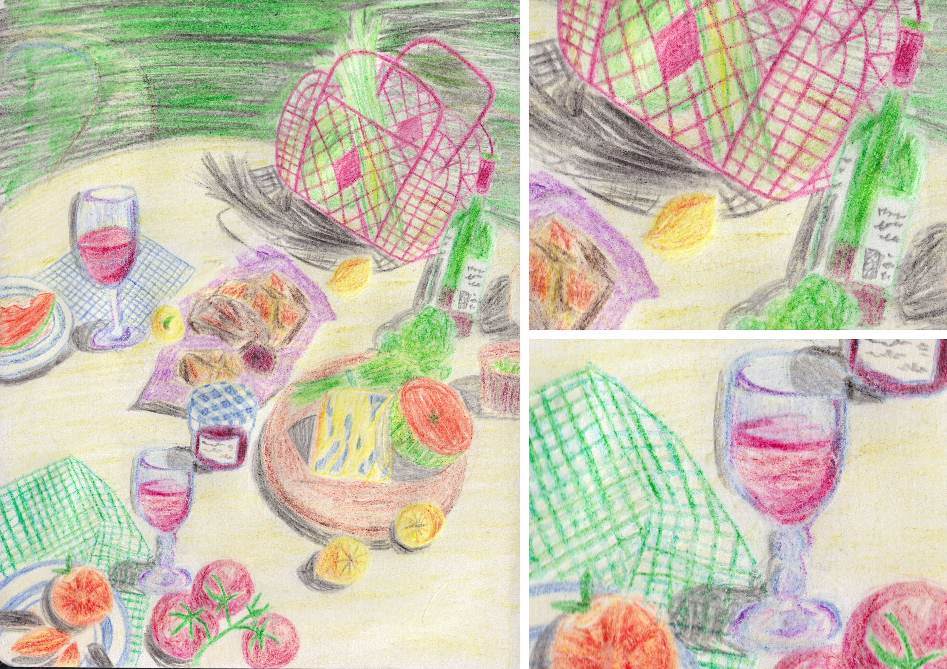
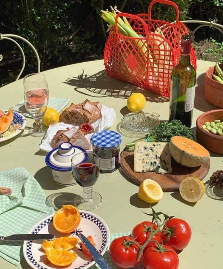
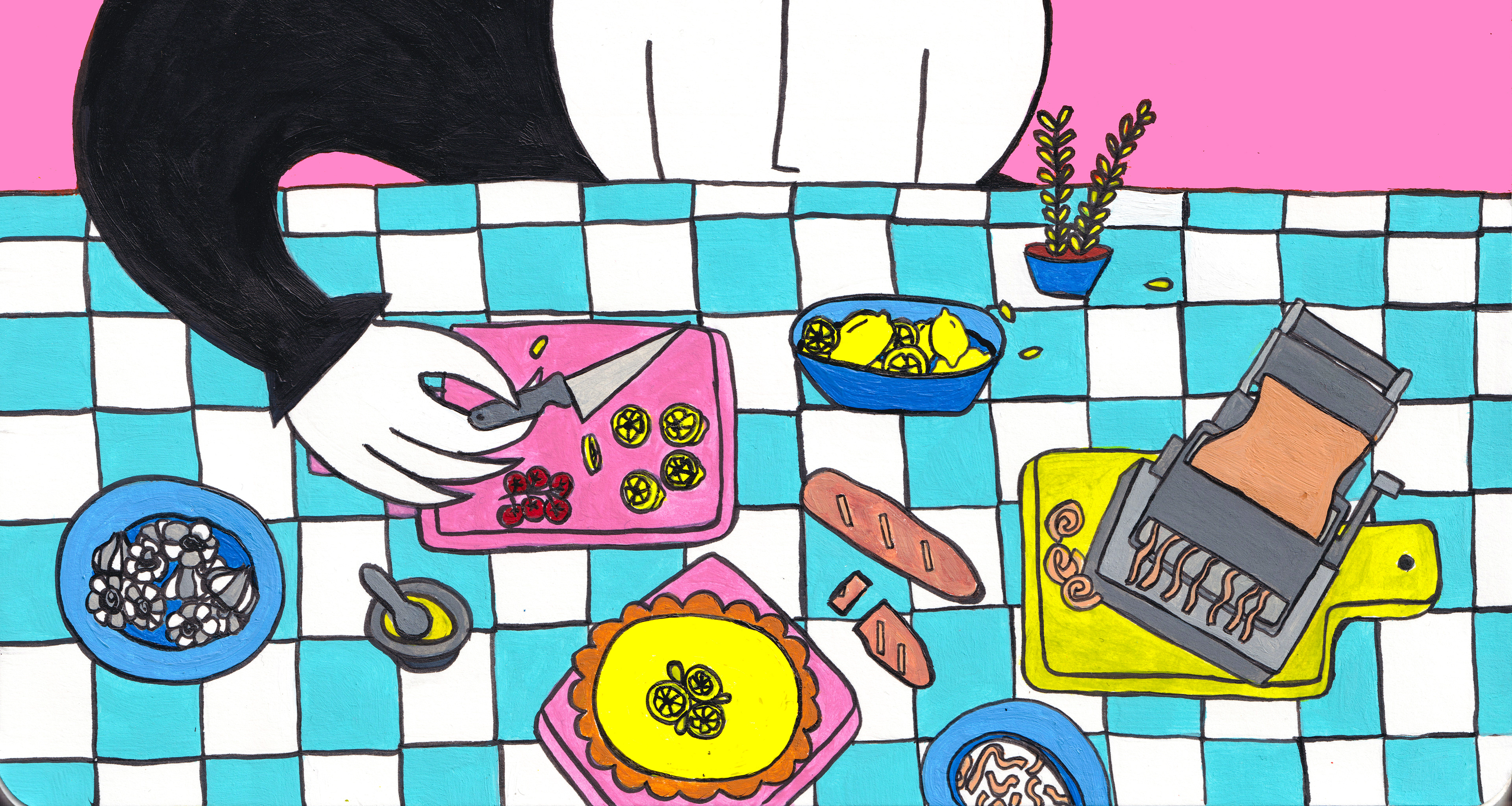
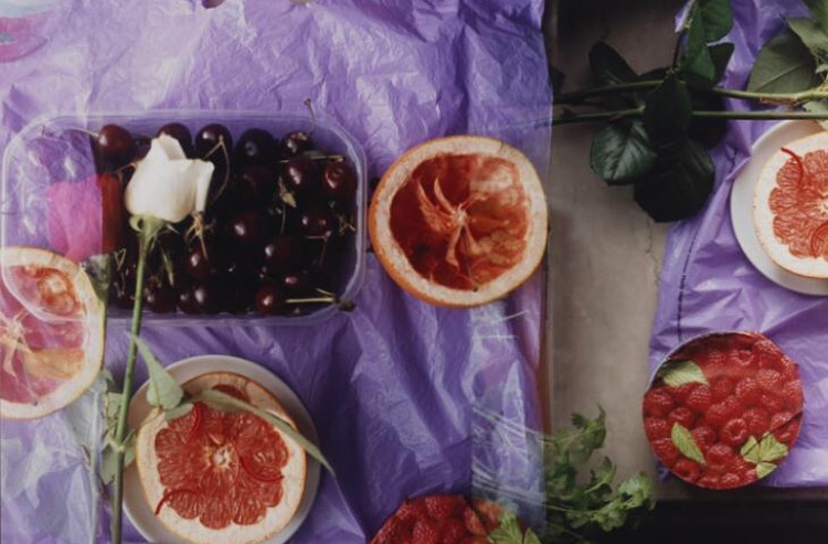
Week 26: The thing that drew me to the original image (on the left) was the red weaved basket, which would personally be a possession of dreams, and the cluttered table filled with such a lovely array of colour and texture - I wish to be there, glass in one hand and a freshly baked piece of bread in the other, sharing an afternoon with some with friends.
To create this piece I used a combination of all the coloured pencils I could find! Often blending and going over one section with layer upon layer of colour until I felt relatively happy. Overall I learnt that perhaps it would've been better to do a full sketch first so I could be sure to fit everything in frame, but at the same time I like the rough outcome, which is something that could only come from just going for it