In The Heights | Animated Typography and Dance
I'm such a big fan of In The Heights! So you can only imagine my excitement when a film was announced and the day of it coming out is soon approaching! This is why I had to sit down and do a tribute to the shows iconic logo and sense of passion and motion.
Why did I animate the type?
For 1) the musical is full of life and movement 2) In the title the word 'Heights' gave me the initial idea to raise the type, but its in 3) how the letters almost looked like a skyline calling that conceptualised one side raising to form a megaphone, as to show how the musical amplifies voices that are often silenced and trampled.
Other small details include having the stars on the top row of type change from unfurling to reveal the American flag, to showing the Dominican Republic flag as this is the heritage of so many of the cast, and a big part of the shows story.
In addition to the logo I also did a little gif which followed some of the movements that are popular in Salsa music, of which In The Heights showcases (and is a big part of why I love the music) :)
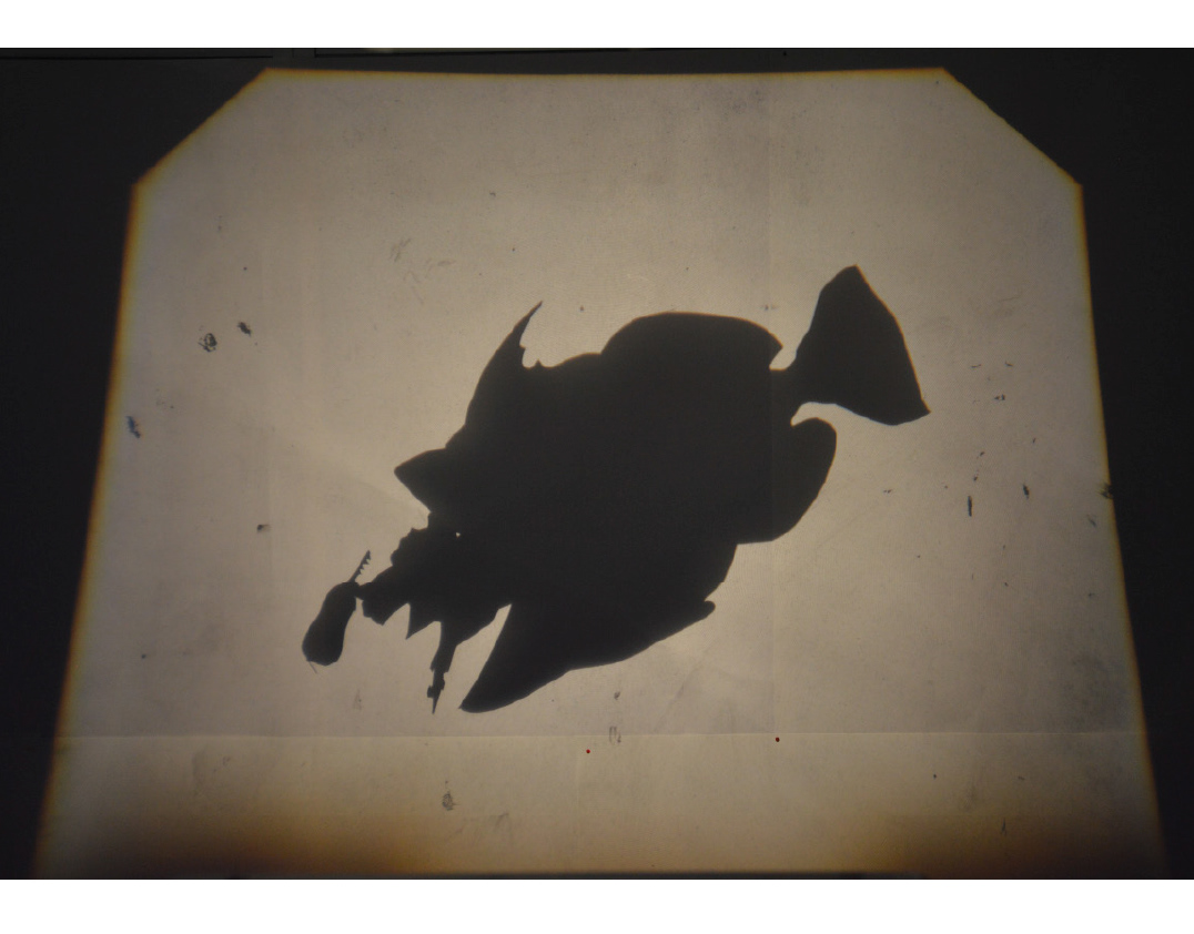
To create the above I used two different references, the logo of the show itself and a sheet of silhouetted salsa dancer:
It was so cool just spending an afternoon working on this and listening to the musical as I went. Procreate is such a gem for short animations like this! And I'll definitely be doing some more type animations!
